Scatter plot
The iterative file contains the database of combinations of input
variables and function values of each evaluated sample used by the Core Solver.
It holds this info together with names of input variables, boundaries of the domain,
etc. The .itr file is updated when the whole batch of samples required by the
Core Solver is computed and able to be loaded as the
DataProcessOut.txt file (the plain text ASCII file with output values).
The iterative file is created in the
process of Uncertainty Quantification and
Preliminary Analysis method.
The Scatter plot feature shows the plot of the relation between input variable values and corresponding output values. This gives the user a quick graphical reference about the distribution of samples according to function value and basic trends in computed data. When multiple outputs are selected for the plot, their correlation can be seen too.
How to use the interface
Data from the iterative file are presented in the form of a scatter plot, as shown in Figure 1. For the setup of the plot, there is a collapsible box on the left side of the tab with the opened iterative file. Right under the Scatter plot label, there is a clickable list of input variables of the project. Selected input defines the color scale of the plot as well as the color of each depicted sample. Under the list of inputs, the list of outputs is located. With tick-boxes, it is possible to select up to two outputs, whose function values will show along axes of the plot.
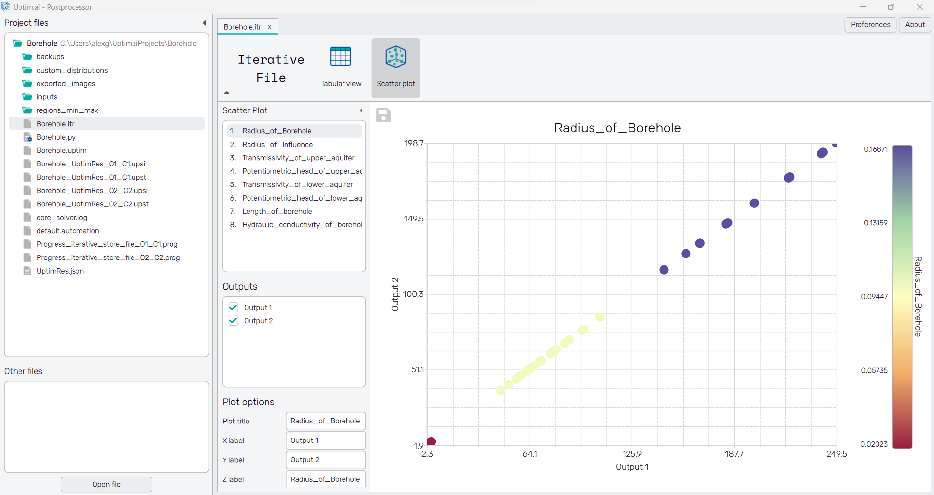
Samples stored in the .itr file are shown as points of the plot. Its title is by
default the name of the selected input variable. The plot itself can
be exported as a .png or .jpg image with the 💾 icon on the top left of
the workspace. It is possible to adjust the appearance of the plot using controls from
the Plot options section of the panel on the left:
-
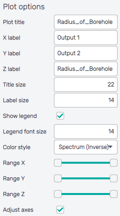
Plot title : Displayed above the plot, input variable name by default.
-
X label : Label of the X axis, first selected output notation by default.
-
Y label : Label of the Y axis, selected input variable name or second selected output notation by default.
-
Z label : Label of the colorbar/function value scale, input variable name by default.
-
Title size : Size of the title font.
-
Label size : Size of the label font.
-
Show legend : Switching on/off the legend of the plot/the colorbar scale.
-
Legend font size : Size of the legend font.
-
Color style : Selection menu setting the colormap of input variable values.
-
Range X : Double-sided slider allowing to show a slice of the data in detail. Dragging one of the slider's points limits the depicted range of output value, one can move with the section along the X-axis by dragging the green bar of the slider (both edge points are highlighted).
-
Range Y : Double-sided slider allowing to show a slice of the data in detail. Dragging one of the slider's points limits the depicted range of output value, one can move with the section along the Y-axis by dragging the green bar of the slider (both edge points are highlighted).
-
Range Z : Double-sided slider allowing to show a slice of the data in detail. Dragging one of the slider's points limits the depicted range of input variable value, one can move with the section along the range of the input by dragging the green bar of the slider (both edge points are highlighted).
All ranges in the plot can be also precisely using the ⚙ icon on the right of each slider. This opens a sub-dialogue with entry fields for writing exact values of range limits. These need to be confirmed with the Set button. Setting values outside domain's boundaries will reset range limits to the default state.
-
Adjust axes : Toggle if the axis and/or colorbar limits of the plot should be only the range adjusted with the slider above (on) or the full range of the input distribution (off).