Data Analysis (multiple datasets)
Uptimai Data Analysis (multiple datasets) is a feature that allows the generation of multiple surrogate mathematical models at the same time. Mainly it is running several instances of the Data Analysis method, with the addition of a comparison of the models at the end.
For every independent model, it allows performing the full study of dependencies of output values on uncertain inputs, not only sensitivities to input variables. On the full model, it is possible to prepare the complete set of visualizations of these dependencies and walk in detail through all statistical characteristics of the model. It also allows statistics-based optimization, in which results are again delivered in the form of easily readable graphics, giving the user straightforward hints for increased performance in a range of e.g. operational and environmental conditions, or manufacturing tolerances.
Finally, for the global summary, it allows correlation analysis between all the models themselves together with correlation of anomalies for every output.
How to use the interface
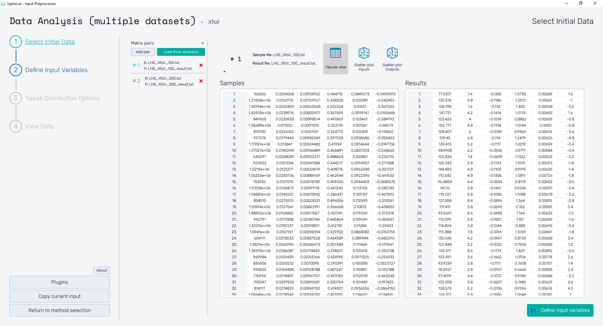
The general appearance of the program window, especially its left section, is described in detail in the Input preparation link. Here the main focus is on the other part which is to a certain point individual for each of the supported methods. The initial of the GUI window when preparing inputs for the Data Analysis (multiple datasets) is shown in Figure 1, as the user starts from scratch and needs to Select Initial Data.
Select Initial Data
In the beginning, the user needs to select source files with the necessary data. Under Matrix Pairs, there are two options for loading the data. Similar to the Data Analysis method, where a pair of Matrices (inputs and outputs) are selected, in this case, it is the same but with the addition that multiple pairs can be selected (each pair corresponds to an independent model). The pairs can be loaded independently by clicking the Add pair button, which opens a pop-up window in which you can select the Sample matrix file (matrix of inputs), and Result matrix file (Matrix of outputs). It is possible to repeat this process as many times as datasets you have.
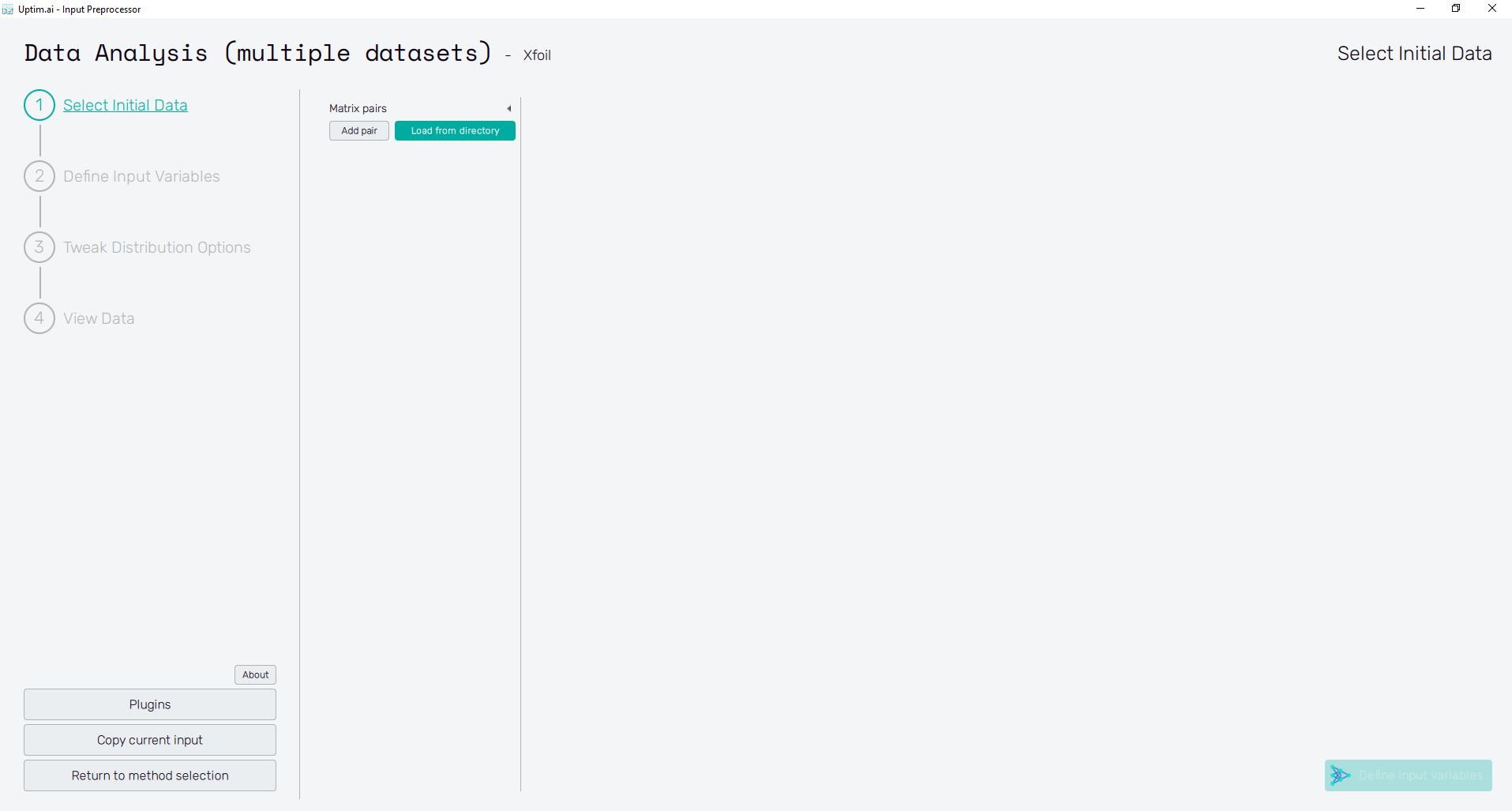
There is another way of uploading multiple pairs at once, designed for problems that have lots of pairs. This option comes under the Load from directory button, which allows you to select a directory where the data is stored (Directory) and automatically pairs the files inside this directory. There are two requirements that the software needs to understand which file is which.
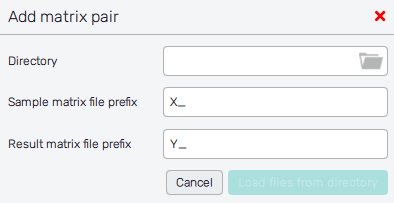
The first condition is to separate the input files from the output files, and that is solved by requiring that these two types of files have to start their name with a preselected prefix. In the case of the inputs, the file has to start with the prefix selected under (Sample matrix file prefix, by default X_), and in the case of the outputs they have to start with the prefix selected under (Result matrix file prefix, by default Y_). The second condition is that the name after the prefix has to be the same for coupling pairs, so they can be connected (one input file with one output file).
For example, if you have three datasets, a valid naming convention for automatic selection would be:
- X_model1
- Y_model1
- X_model2
- Y_model2
- X_model3
- Y_model3
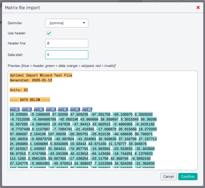
The matrix files can be either .csv/.txt files (comma separated values) or .bin files. In case of the text files,
the Matrix file import dialog will be shown (Figure 3). It allows the user to configure, how the
file should be read, mainly setting:
- the delimiter (comma, space, ...)
- the number of rows to skip,
- if a header row is present and which one is it (can be used to detect variable names for the next step),
- on which line the numerical data begin.
The first few lines of the file are loaded as a preview, so the user can visually check the correctness of their settings.
In case multiple files are loaded at once, it is assumed that the format of those files is the same and the Matrix file import dialog is shown only once for Sample files and once for Result files. If matrix pairs are added individually, it is allowed to set the import format for the individual files.
It is also possible to load .bin files, which are pickled numpy 2D arrays. This is mainly intended for use with
Preprocessor plugins, however one can create such files manually. This can be useful
when dealing with very large datasets, as it decreases both the file size and the loading time. Here is an example
Python code to create such file (4 samples for 3 variables):
import pickle
import numpy as np

matrix_x = np.array([
    [1, 2, 3],
    [2, 3, 4],
    [3, 4, 5],
    [4, 5, 6]
], dtype=float)

with open("MatrixX.bin", mode="wb") as f:
    pickle.dump(matrix_x, f)
The number of lines must be the same inside each pair. Otherwise, the user cannot successfully continue to Define Input Variables with the Define input variables button or the same-called fishbone item.
Tabular View
Loaded samples are immediately shown in the form of tables, one for Samples (matrix X) and the other for Results (matrix Y). The number of lines must be the same in both matrices. This rule applies for each pair of loaded files. Otherwise, the user cannot successfully continue to Define Input Variables with the Define input variables button or the same-called fishbone item. Hovering over the disabled button with the mouse pointer Also, features Scatter plot Inputs and Scatter plot Outputs cannot be accessible either.
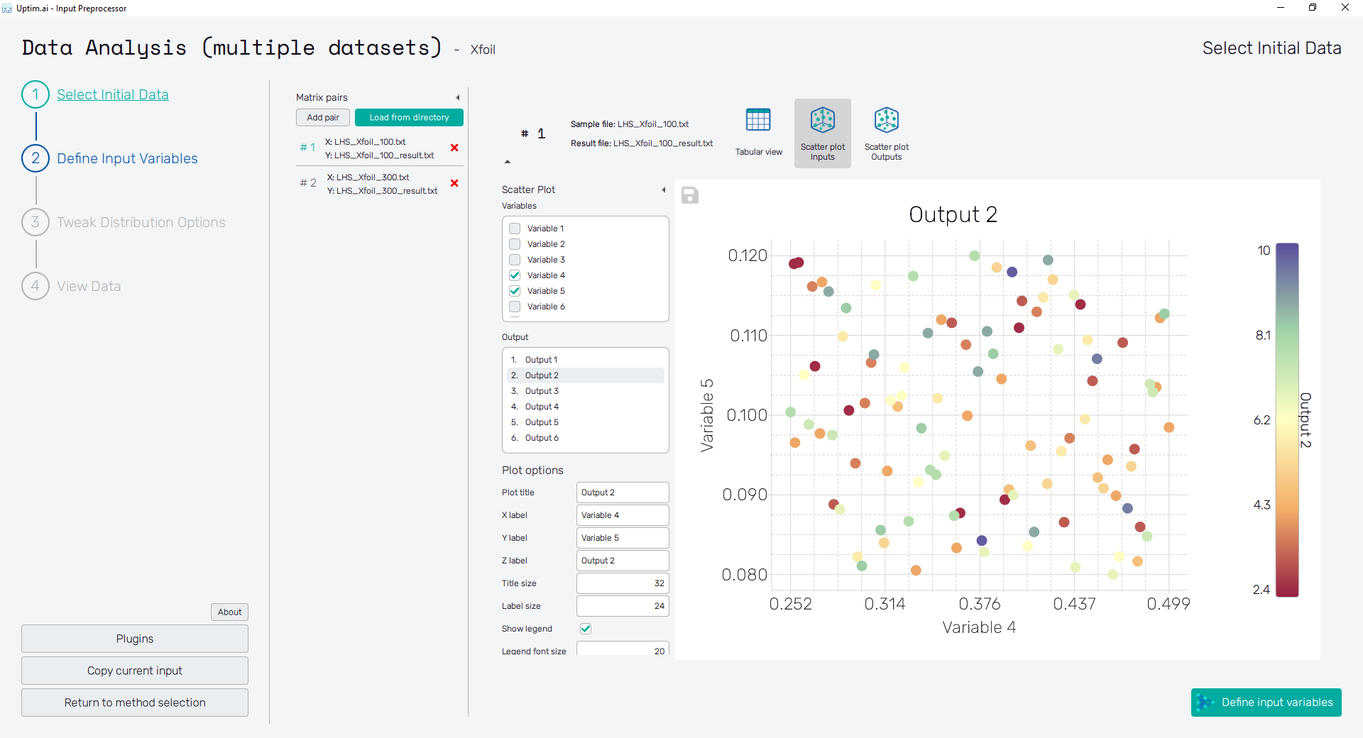
Scatter Plot Inputs
The Scatter Plot Inputs feature shows the plot of the relation between input variable values and corresponding output values. This gives the user a quick graphical reference about the distribution of samples alog the range of each input variable, the possibility of correlation between selected inputs, and correlation between selected input variable and output.
In this mode, with checkboxes of the list on the left the user can select up to two Variables that will appear on axes of the plot. Values of the Output selected from the list right below are represented with the color of each sample. In case only one variable is selected, the output takes place on the vertical axis.
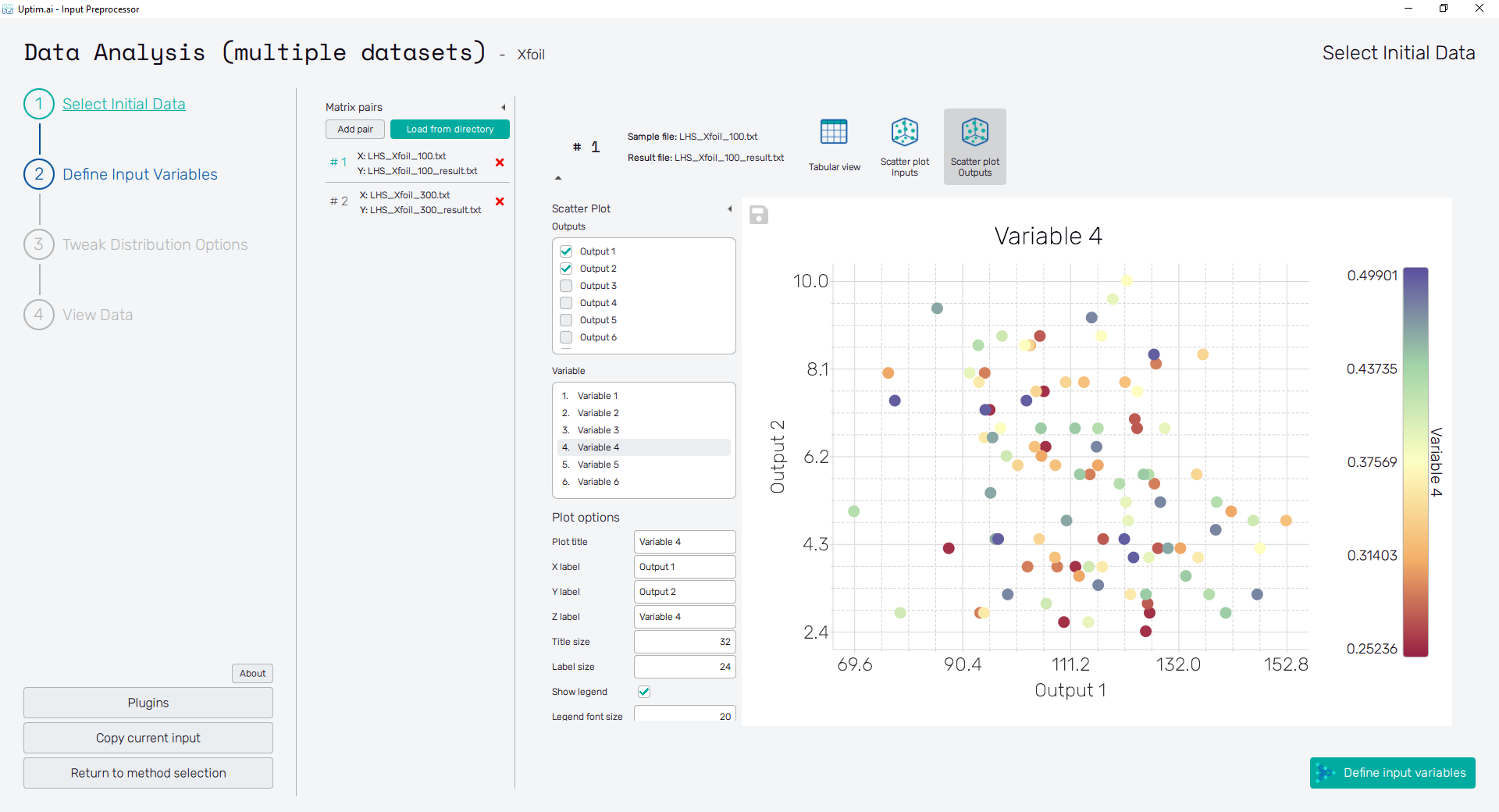
Scatter Plot Outputs
The Scatter Plot Outputs feature shows the plot of the relation between output values and corresponding input variables values. So, the principle here can be considered as an inverse plot to the previous one. It gives the user a quick graphical reference about the distribution of samples alog the range of output values, the possibility of correlation between selected outputs, and correlation between selected output and input variable.
In this mode, with checkboxes of the list on the left the user can select up to two Outputs that will appear on axes of the plot. Values of the Variable selected from the list right below are represented with the color of each sample. In case only one output is selected, the input variable takes place on the vertical axis.
To export the plot as a .png or .jpg file, the save-file dialogue can be induced
by clicking the 💾 icon on the top left of the plot.
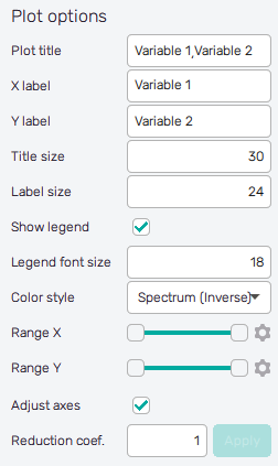
The appearance of the scatter
plot can be changed in both features using the settings in the Plot options section.
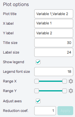
-
Plot title : Displayed above the plot, names of selected input variables by default.
-
X label : Label of the X axis, first selected input variable name by default.
-
Y label : Label of the Y axis, second selected input variable name by default or the name of the single selected input variable.
-
Title size : Size of the title font.
-
Label size : Size of the font for both axis labels.
-
Show legend : Switch turning on/off the legend of the plot.
-
Legend font size : Size of the legend font.
-
Color style : Selection menu setting the colormap of input variable values.
-
Range X : Double-sided slider allowing to show a slice of the data in detail. Dragging one of the slider's points limits the depicted range of input variable values, one can move with the section along the X-axis by dragging the green bar of the slider (both edge points are highlighted).
-
Range Y : Double-sided slider allowing to show a slice of the data in detail. Dragging one of the slider's points limits the depicted range of input variable values, one can move with the section along the Y-axis by dragging the green bar of the slider (both edge points are highlighted).
All ranges in the plot can be also precisely using the ⚙ icon on the right of each slider. This opens a sub-dialogue with entry fields for writing exact values of range limits. These need to be confirmed with the Set button. Setting values outside the domain's boundaries will reset range limits to the default state.
-
Adjust axes : Toggle if the X-axis range of the plot should be only the range adjusted with the slider above (on) or the full range of the input distribution (off).
-
Reduction coefficient : Variable that reduces the total number of samples that are plotted for an easier interpretation of results. If set to , the whole set of samples will be depicted.
Define Input Variables
On top of the window, there is an entry field # of Monte-Carlo samples setting the number of samples to be used for Monte Carlo sampling used for model propagation and visualizations. It must be an integer value between 1,000 and 1,000,000. The default value of 100,000 is based on the best-practice trade-off between the speed of the solver and postprocessor, file sizes, and model precision.
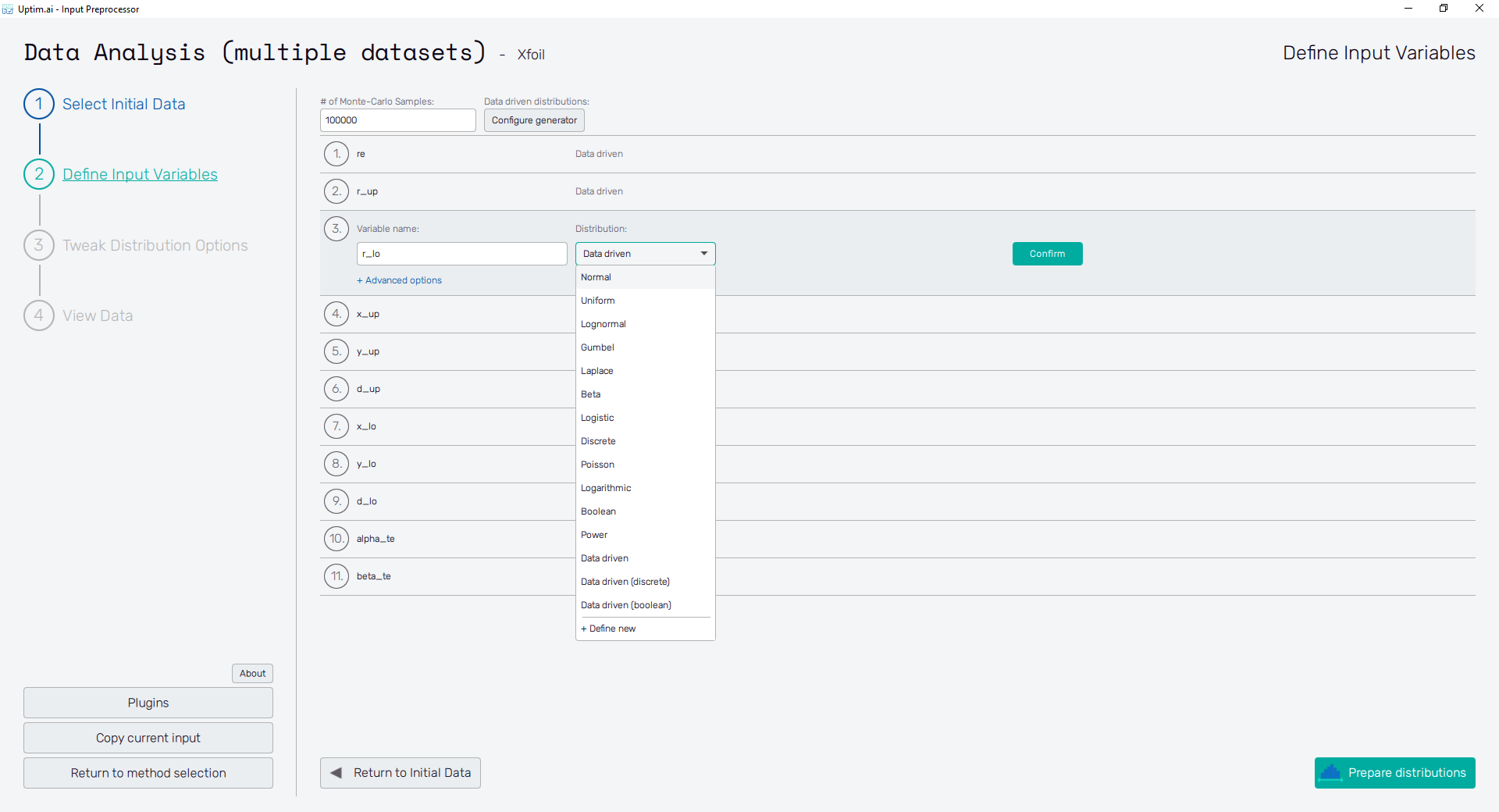
The number of input variables depends on sampling loaded from files in the previous step. This prevents the incompatibility of loaded data with the definition of inputs for the Uptimai solver. The ordering of variables cannot be changed for the very same reason. However, types and parameters can still be edited as in Figure 8. The input variable can be set using the following controls:
- Variable name : Label of the input parameter, which is being used throughout the whole process up to the postprocessing. The variable name cannot contain empty spaces, these are automatically replaced with underscores.
- Distribution : Selection box where the user sets the shape of the probabilistic function for the input variable. According to the distribution type selected, additional entries with shape parameters appear. A detailed description of featured probability distribution types can be found in the section Input distribution types.
- Confirm : Any changes need to be confirmed with this button to take effect.
- + Advanced Options: Activation Type : Allows change between Active (by default) and Inactive. Active means that the intrinsic uncertainty of the variable will be propagated and Inactive means that only the nominal value will be used (the variable won’t be studied).
The Prepare distributions button invokes the preparation of randomly distributed samples according to the settings. If needed, the process can be stopped using the Cancel button, which appears while the samples are being generated. In case there are invalid entries in the input variable definition, the user is informed and not allowed to continue to the next step until everything is by the book.
Then, the Prepare distributions button itself turns into Tweak Distribution Options, sending the user to this next step. Also, the Tweak Distribution Options item is activated in the fishbone navigation bar on the left.
Tweak Distribution Options
At this point, the user adjusts the boundaries of the input domain and the so-called nominal sample. Boundaries are recommended to be adjusted especially for distribution shapes where the user defines parameters like mean value and standard deviation. In these cases, the edges of the domain depend on the randomization of samples within the input variable. Thus, modification is usually required to set the exact range for such inputs. For certain types of distribution shapes like uniform or discrete, edges of the domain are exactly given by the distribution shape definition and cannot be changed after.
The nominal point is a sample acting as a baseline for the created surrogate model and analysis. In the model, the results of all data samples are compared with the result value of the nominal sample. This process allows handling the effects of input parameters and their interactions separately as increments to the nominal value. It must be within the range of each input variable and not be equal to its boundaries. Although not strictly necessary, it is recommended to place the nominal sample into the statistical centre of the domain. Then, the process of the surrogate model creation is most efficient and precise. The nominal sample's default position is suggested as the mean of the probability distribution of each input variable. When changing its position, (shown in Figure 9) it is advised not to shift it by more than 10% of the range of each input. As in the case of input variable distribution definition, all changes must be saved using the Confirm button.
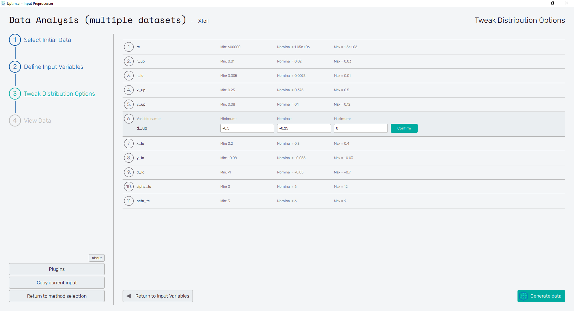
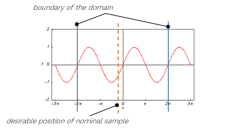
For the sampling of variables leading to periodic or symmetrical functions (typically, but not exclusively, angles of any kind), extra caution is required. It is highly recommended not to set their nominal value exactly to the centre of symmetry of the corresponding input distribution! A typical example can be the angular position of a crankshaft, wave phase, etc.
Clicking the Generate data in the bottom-right corner saves .txt file
containing samples randomly distributed according to the settings and input domain info.
If needed, the process can be stopped using the Cancel button, which appears while the samples
are being generated.
Then, the Generate data button itself turns into a View Data Histogram, sending the user to this next step. Also, the View Data Histogram item is activated in the fishbone navigation bar on the left. For fundamental changes in any input distribution, the user can return to the previous step with the Return to Input Variables button.
View Data
In this section, all created input variables can be reviewed to check the generated distributions of Monte-Carlo samples. It is recommended to provide such type of check before an actual data analysis run to prevent solver crashes and eliminate misinterpretation of results.
At the top of the screen, users can switch between two Data view options:
Histograms and Scatter plot. Common for both modes is that shown figures
can be saved as *.png or *.jpg files with the 💾 icon placed on the upper left of
the plot.
Plus, there are two more buttons under the plot. Return to Distribution Options brings users back
to the previous step of Tweak Distribution Options where they can fix boundaries or
the nominal sample position. The other button will Close Preprocessor since all the input files
required are ready for the next step, which is Core Solver Setup.
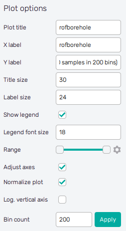
Histograms
Histograms are the default view mode, showing the statistical distribution of randomized samples along the range of each input variable. Additional vertical lines that can be seen in the plot show the boundaries of the input variable distribution (input domain edges) and the position of the nominal sample. Also, clicking into the plot invokes the cross with a label showing the exact value of the selected point in the histogram.
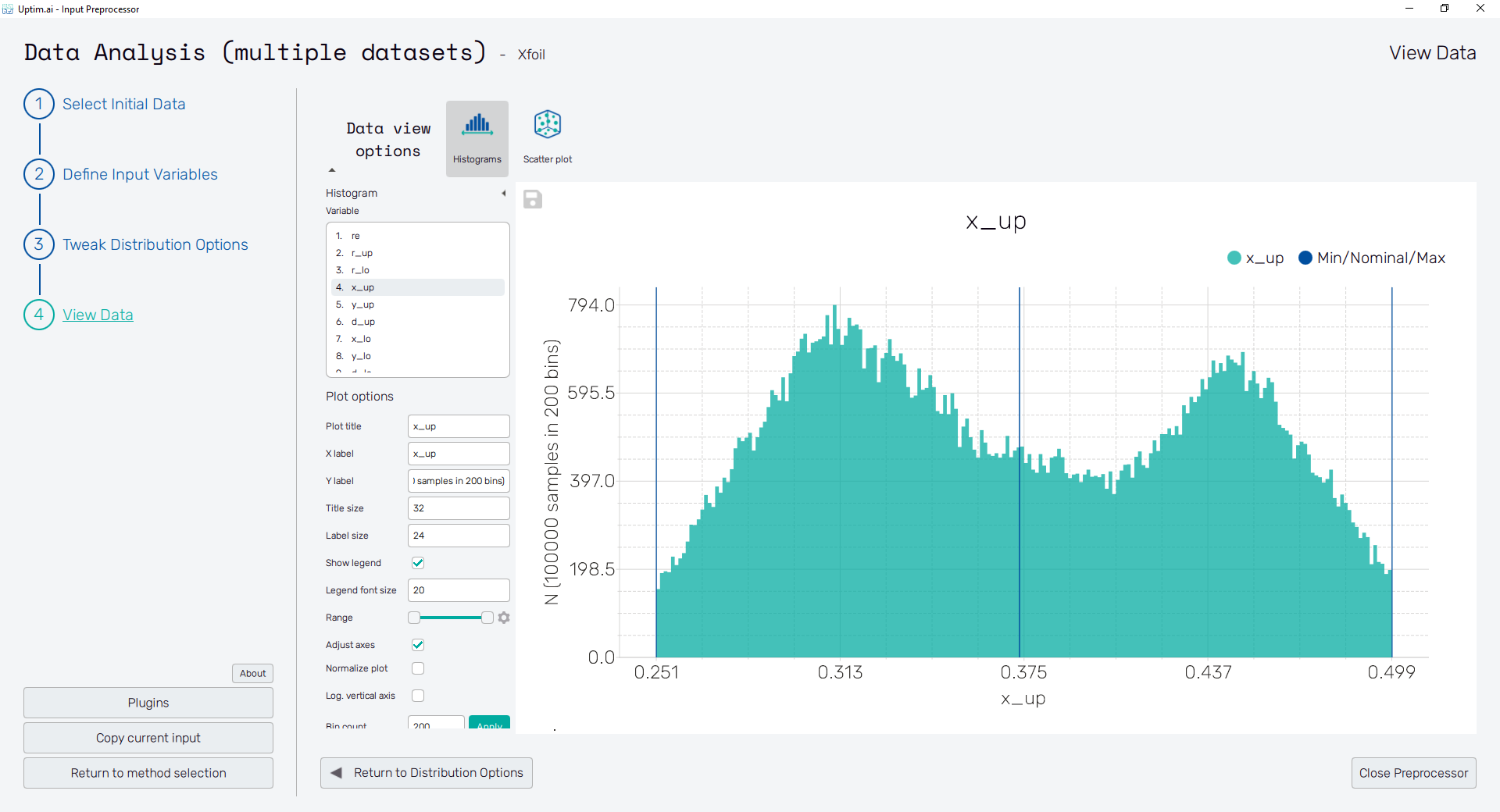
To the left of the actual histogram plot, there are controls of the figure to be shown. The box labelled Variables contains the list of input parameters available in the domain. Each item can be selected by mouse clicking, showing the corresponding distribution shape. The appearance of the plot can be changed using the settings in the Plot options section:
-
Plot title : Displayed above the plot, input variable name by default.
-
X label : Label of the X axis, input variable name by default.
-
Y label : Label of the Y axis. The default text contains the number of samples used for the histogram and the number of bins these are split in.
-
Title size : Size of the title font.
-
Label size : Size of the font for both axis labels.
-
Show legend : Switch turning on/off the legend of the plot.
-
Legend font size : Size of the legend font.
-
Range : Double-sided slider allowing to show a slice of the input distribution in detail. Dragging one of the slider's points limits the depicted range one can move with the section along the X-axis by dragging the green bar of the slider (both edge points are highlighted).
All ranges in the plot can be also precisely using the ⚙ icon on the right of each slider. This opens a sub-dialogue with entry fields for writing exact values of range limits. These need to be confirmed with the Set button. Setting values outside the domain's boundaries will reset range limits to the default state.
-
Adjust axes : Toggle if the X-axis range of the plot should be only the range adjusted with the slider above (on) or the full range of the input distribution (off).
-
Normalize plot : Turn on/off normalization of the histogram. Y-axis values change accordingly, Y-axis' default label changes from N to Density.
-
Log. vertical axis : Turns on/off logarithmic scaling of the Y-axis.
-
Bin count : Set the number of bins for the histogram. The recommended value is below . Needs to be confirmed with the Apply button.
Scatter plot
The scatter plot shows the actual positions of randomized samples in the domain. For the setup of the plot, on the left side, there is a checkbox list of the input variables. Users can select one or two input Variables at a time. When only one input variable is selected, it is drawn on both horizontal and vertical axis. The appearance of the plot can be changed using the settings in the Plot options section.
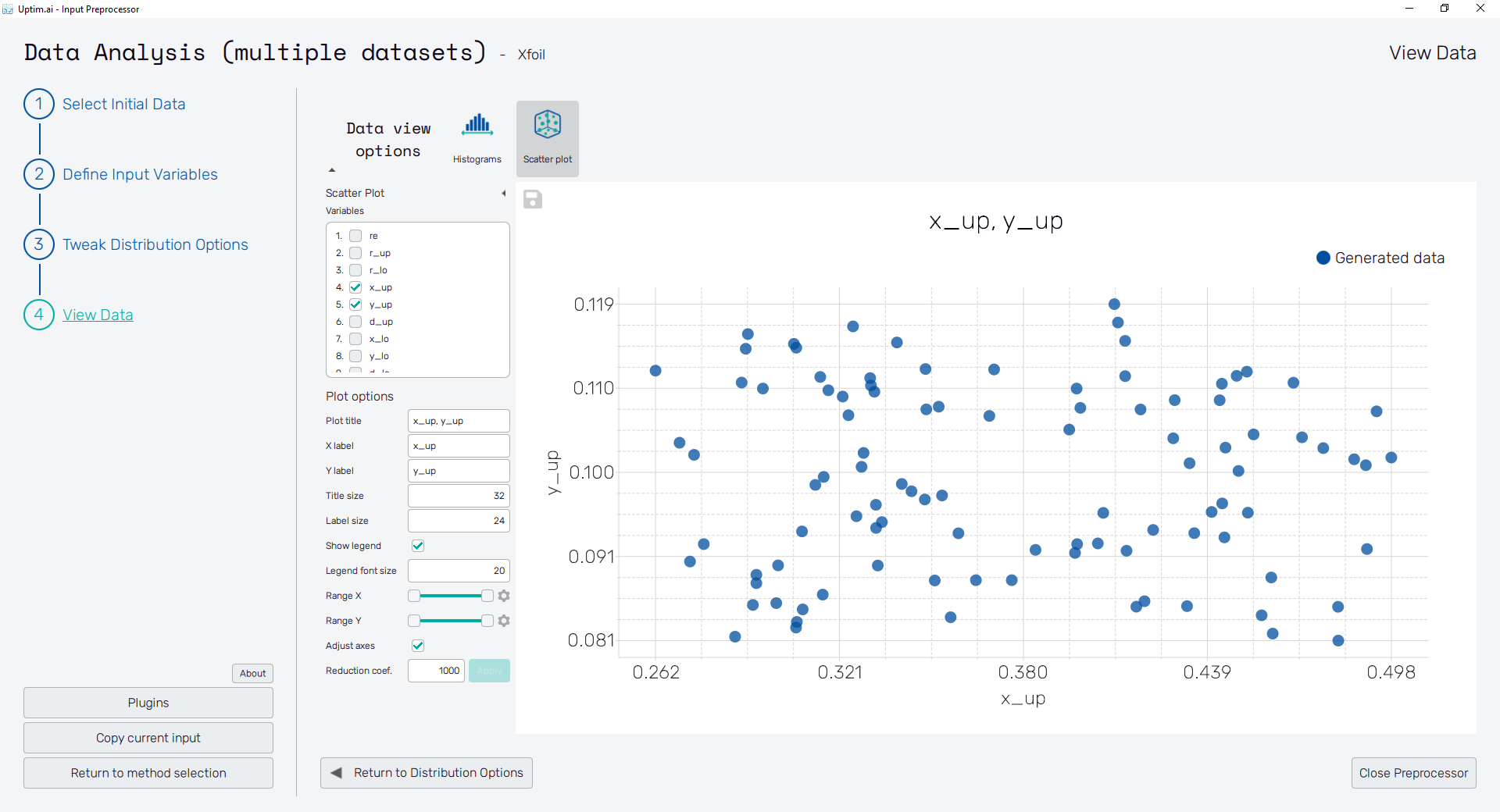
-
Plot title : Displayed above the plot, names of selected input variables by default.
-
X label : Label of the X axis, first selected input variable name by default.
-
Y label : Label of the Y axis, second selected input variable name by default or the name of the single selected input variable.
-
Title size : Size of the title font.
-
Label size : Size of the font for both axis labels.
-
Show legend : Switch turning on/off the legend of the plot.
-
Legend font size : Size of the legend font.
-
Range X : Double-sided slider allowing to show a slice of the data in detail. Dragging one of the slider's points limits the depicted range of input variable values, one can move with the section along the X-axis by dragging the green bar of the slider (both edge points are highlighted).
-
Range Y : Double-sided slider allowing to show a slice of the data in detail. Dragging one of the slider's points limits the depicted range of input variable values, one can move with the section along the Y-axis by dragging the green bar of the slider (both edge points are highlighted).
All ranges in the plot can be also precisely using the ⚙ icon on the right of each slider. This opens a sub-dialogue with entry fields for writing exact values of range limits. These need to be confirmed with the Set button. Setting values outside the domain's boundaries will reset range limits to the default state.
-
Adjust axes : Toggle if the X-axis range of the plot should be only the range adjusted with the slider above (on) or the full range of the input distribution (off).
-
Reduction coefficient : Variable that reduces the total number of samples that are plotted for an easier interpretation of results. If set to , the whole set of samples will be depicted.