Increment
A histogram is a representation of the distribution of numerical data. It is an estimate of the probability distribution for an uncertain output/s. A histogram is well-known and understood. However, our approach allows something we call partial histograms. These partial histograms represent a partial part of the final histogram and their sum creates the final histogram. This allows visualizing how each part of the variable influences the final distribution.
The Influencer directly compares the final distribution against a distribution with several increment functions neglected from the final model (labelled in the plot as selected probability density function, aka Selected PDF). This allows a comparative visualization of the influence of the selected increment functions and highlights the right aspects of the problem. For a better perspective, the full probability distribution function (Full PDF) is visualized in the background.
How to use the interface
There is a collapsible box on the left side of the tab with the opened result file, where the user can set the data to be displayed. Variable and Increment buttons on top change the type of parts the dataset contains. It is possible to include or exclude increment functions from the set of displayed data via checkboxes next to each increment function name. The selection of items can be also modified with three buttons under the list. The Invert button does the reverse action of all checkboxes in the list. Select all and Unselect all buttons turn all checkboxes on/off.
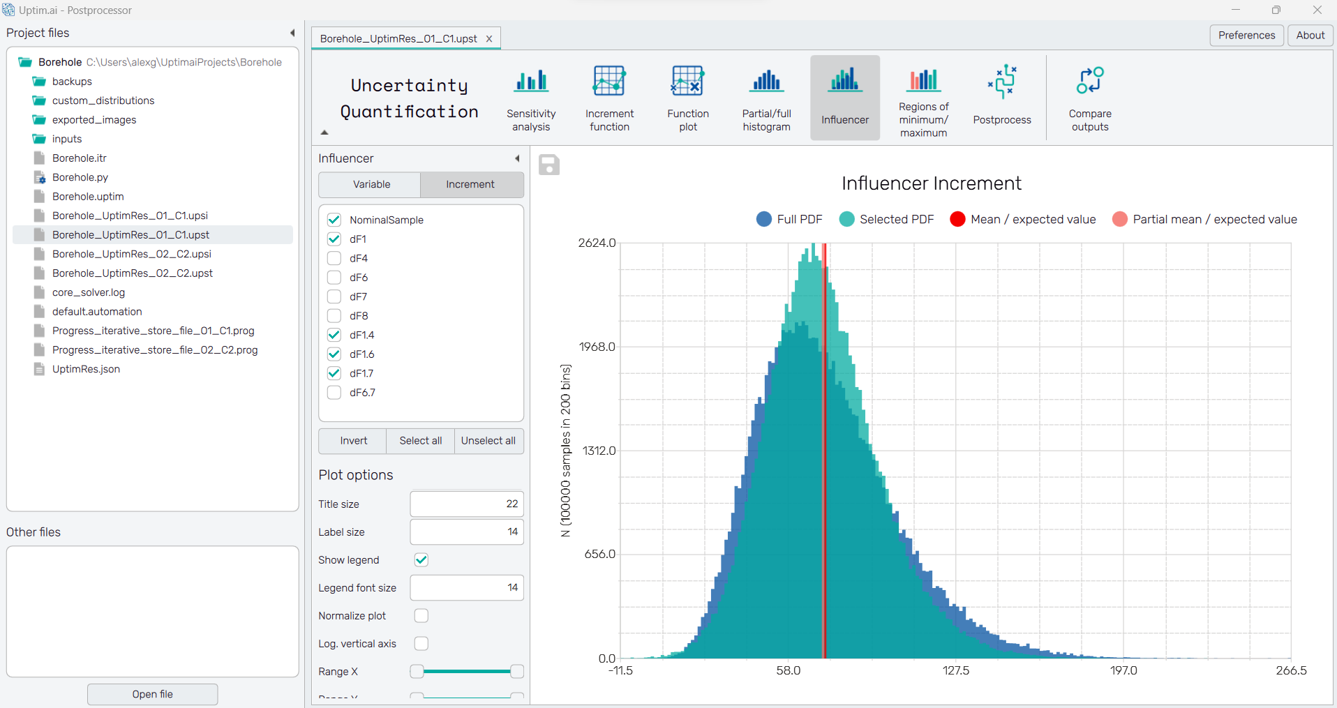
In the plot, there are always two histograms, the Full PDF for the full model and the Selected PDF where some increment functions may be excluded. The vertical line labelled Mean/expected value refers to the mean function value as it is expected based on the mathematical model. The Partial mean/expected value is the mean function value computed for the Selected PDF.
To export the plot as a .png or .jpg file, the save-file dialogue can be induced
by clicking the 💾 icon on the top left of the plot.
It is possible to adjust the appearance of the plot using controls from
the Plot options section of the panel on the left:
-
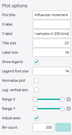
Plot title : Displayed above the plot, Full histogram by default.
-
X label : Label of the X axis, empty by default.
-
Y label : Label of the Y axis, N by default together with info about the number of samples used for visualization and the current number of bins.
-
Title size : Size of the title font.
-
Label size : Size of the label font.
-
Show legend : Switching on/off the legend of the plot/the colorbar scale.
-
Legend font size : Size of the legend font.
-
Normalize Plot : Normalization of histogram plot, toggle on/off.
-
Log. vertical Axis : Logarithmic scale of vertical axis, toggle on/off.
-
Range X : Double-sided slider allowing to show a slice of the data in detail. Dragging one of the slider's points limits the depicted range of bins, one can move with the section along the X-axis by dragging the green bar of the slider (both edge points are highlighted).
-
Range Y : Double-sided slider allowing to show a slice of the data in detail. Dragging one of the slider's points limits the depicted number of samples in bin/density, one can move with the section along the Y-axis by dragging the green bar of the slider (both edge points are highlighted).
All ranges in the plot can be also precisely using the ⚙ icon on the right of each slider. This opens a sub-dialogue with entry fields for writing exact values of range limits. These need to be confirmed with the Set button. Setting values outside domain's boundaries will reset range limits to the default state.
-
Adjust axes : Toggle if the axis limits of the plot should be only the range adjusted with the slider above (on) or the full range of function values and density/number of samples in bins (off).
-
Bin Count : Number of categories in the histogram.