Function plot
The standard function plot is used to visualize the behaviour of the function of interest. Allows exploring absolute output values through the design space. It can show the value of output for a specified combination of inputs or the output value as a function of up to three selected variables.
How to use the interface
There is a collapsible box on the left side of the tab with the opened result file, where the user can set the data to be displayed. Text mode and Visualize mode buttons on the top switch between these two sub-features.
It is possible to include or exclude input variables from the set of displayed data via checkboxes next to each variable name. For obtaining the function value at a particular slice of the model, values of non-selected input variables should be set in entries on the right side of the list. The user needs to respect the limits given by ranges of input variables defined by boundaries in the pre-processing process. These boundaries are shown in brackets next to the name of the variable.
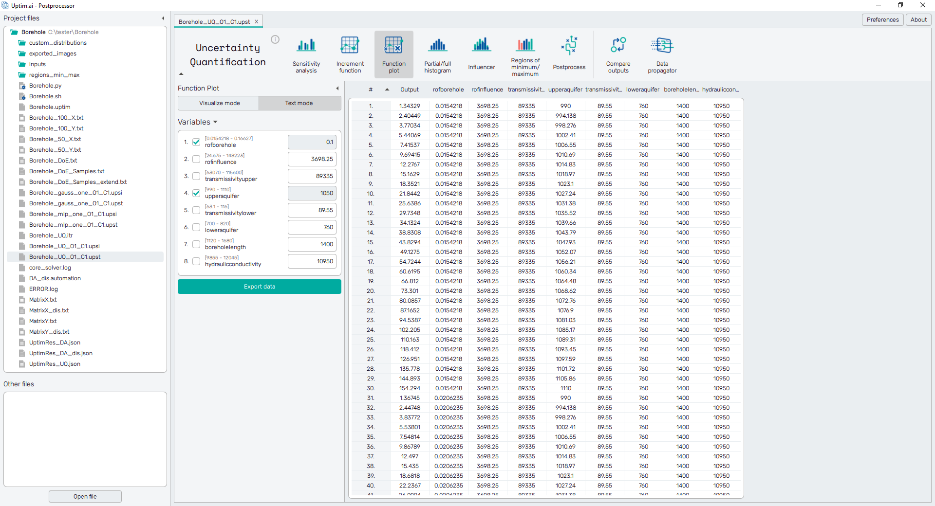
Text mode
Data from the model are presented in the form of a spreadsheet, as shown in Figure 1. It is possible to change the sorting of the sheet (ascending or descending, where ascending is the default) by clicking on the row number or labels of sensitivities.
The green Export data button underneath the list of input variables
saves the currently displayed data into a .csv or .txt file.
Visualize mode
In Visualize mode is the data presented in the form of a curve, surface, or 3D scatter plot. An example can be seen in Figure 2. The type of the plot depends on the number of input variables selected. It is possible to show functions with up to three interacting input variables. First-order functions are shown as solid color lines with the function value on the Y-axis of the plot. Second-order functions have the form of a surface, where the function value is also represented by the color of its fill. The coloring is the only way the function value is shown for third-order functions (interactions of three input variables). 3D plots can be rotated while holding the right mouse button and zoomed with the mouse wheel. Left-clicking into the plot shows coordinates and corresponding function value in the plot.
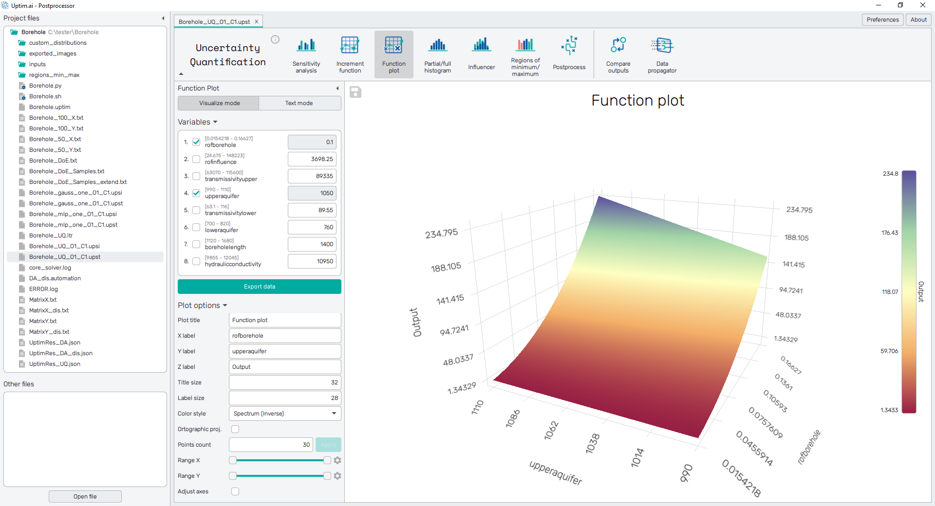
To export the plot as a .png or .jpg file, the save-file dialogue can be induced
by clicking the 💾 icon on the top left of the plot.
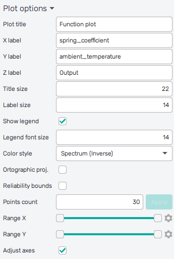
It is possible to adjust the appearance of the plot using controls from
the Plot options section of the panel on the left. The list of controls
currently available may vary according to the selected increment function:
-
Plot title : Displayed above the plot, contains increment function designation by default.
-
X label : Label of the X axis, by default name of the first input variable involved in the selected increment function.
-
Y label : Label of the Y axis, output by default or name of the second input variable involved in the selected increment function of higher-order.
-
Z label : Label of the Z axis, output by default or name of the third input variable involved in the selected increment function of higher-order.
-
W label : Label of the colorbar/increment value scale, output by default.
-
Title size : Size of the title font.
-
Label size : Size of the label font.
-
Show legend : Switching on/off the legend of the plot/the colorbar scale.
-
Legend font size : Size of the legend font.
-
Color style : Selection menu setting the colormap of input variable values.
-
Orthographic proj. : Switch between orthographic (on) and perspective (off) projection of 3D plot.
-
Reliability bounds : For each shown sample, an upper and lower reliability bound is also plotted. Bounds are generated
from a separate model of predicted local error. There are several options of the reliability model method that can be set in the Core Solver Setup GUI. -
Coverage score : For each shown sample, the coverage score is also plotted (the baseline excess maximum score, see description in Preprocessor). This is available only for 1D visualizations.
-
Points count : Density of data along an axis for plot rendering. Confirmed with Apply button.
-
Show samples : Switch on/off source data points of the mathematical model.
-
Range X : Double-sided slider allowing to show a slice of the data in detail. Dragging one of the slider's points limits the depicted range of input variable value, one can move with the section along the X-axis by dragging the green bar of the slider (both edge points are highlighted).
-
Range Y : Double-sided slider allowing to show a slice of the data in detail. Dragging one of the slider's points limits the depicted range of output value, one can move with the section along the range of the output by dragging the green bar of the slider (both edge points are highlighted). In the case of 2nd order interaction limits values of the input variable along the Y-axis.
-
Range Z : Double-sided slider allowing to show a slice of the data in detail. Dragging one of the slider's points limits the depicted range of output value, one can move with the section along the range of the output by dragging the green bar of the slider (both edge points are highlighted). In case the of 3rd order interaction limits values of the input variable along the Z-axis.
-
Range W : Double-sided slider allowing to show a slice of the data in detail. Dragging one of the slider's points limits the depicted range of output value, one can move with the section along the range of the output by dragging the green bar of the slider (both edge points are highlighted).
All ranges in the plot can be also precisely using the ⚙ icon on the right of each slider. This opens a sub-dialogue with entry fields for writing exact values of range limits. These need to be confirmed with the Set button. Setting values outside domain's boundaries will reset range limits to the default state.
-
Adjust axes : Toggle if the axis and/or colorbar limits of the plot should be only the range adjusted with the slider above (on) or the full range of the input distribution (off).