Postprocess
Here the user sees the direct comparison of differences between loaded data values and their approximations according to the model. This error of the model can be also depicted with respect to input variable values to see specifically which part of the model is the most reliable. In principle, the feature was derived from the Postprocessor of the Data Analysis method. But here it is enhanced with the possibility to plot samples of the Propagated set loaded from separate files and then approximated by the existing model. The user can see if e.g. the model is still valid for the new setup of measurements etc.
Evaluation of error
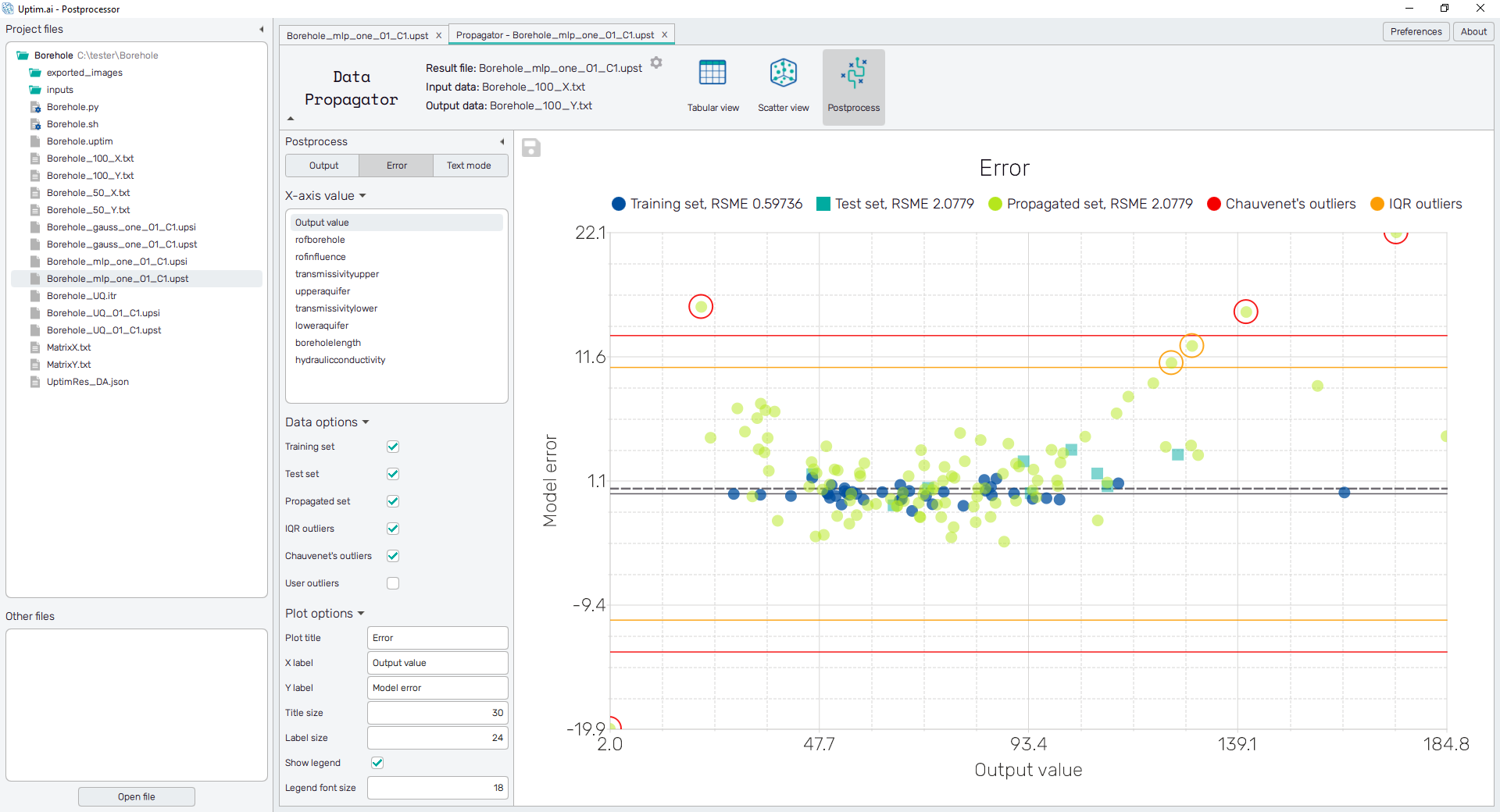
There is an evaluation of samples as outliers based on their magnitude of error from the approximated model
values. These outliers are then marked in colored circles according to the applied
criteria. Currently, three methods of outlier identification are available:
- Chauvenet's criterion : The method works by creating an acceptable band of data around the mean of an assumed normal distribution. The main principle is to find the number of standard deviations that correspond to the bounds of the probability band around the mean and compare that value to the absolute value of the difference between the suspected outliers and the mean divided by the standard deviation of samples. For the complete description of the method visit the link.
- Interquartile range (IQR) : The method is based on comparisons of ranges of data that were first split into quartiles. The IQR is defined as and values below or above are marked as outliers.
- User-defined threshold : Users can define their own threshold for the error value to be marked as an outlier. The default setting is the mean value of Chauvenet's and IQR criterion.
How to use the interface
There is a collapsible box on the left side of the tab with the opened result file, where the user can set the data to be displayed. On the top, there are three buttons switching between two types of visualization of data, Output and Error, and the table is shown under the Text mode.
Output
The Output value is shown here on the vertical axis of the plot. Then, two types of plots can be created depending on the item selected from the list of X-axis value options. There are samples from the Propagated set of data and also the Training set and the Test set of samples in case these were used to create the model with the Data Analysis method. The Root Square Mean Error (RMSE) value is plotted in the legend for each set of samples.
The situation with the Output value selected can be seen in Figure 1. It gives directly the correlation of model results and the source data. Here the Model output value (the approximation of the model) is shown on the vertical axis, while the Output value of samples loaded from source files belongs to the horizontal axis.
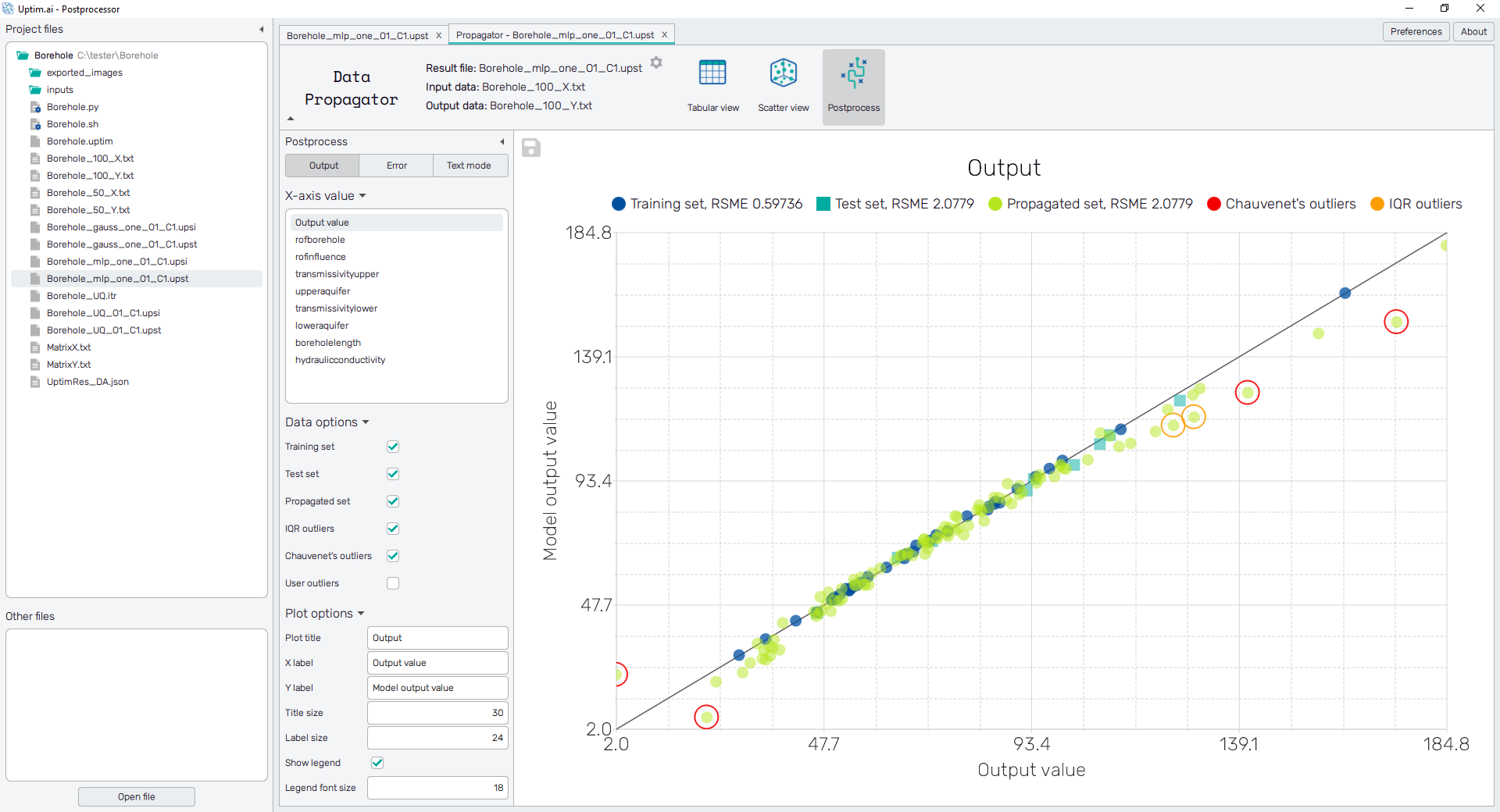
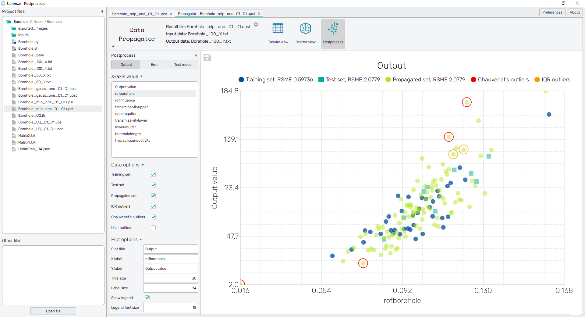
Other options to be selected are names of input variables. The plot then represents the distribution of the Output value as obtained from loaded files along the range of selected input. Also, it helps to identify the positions of outliers together with the context of the output value.
To save the plot as a .png or .jpg file, the save-file dialogue can be induced
by clicking the 💾 icon on the top left of the plot.
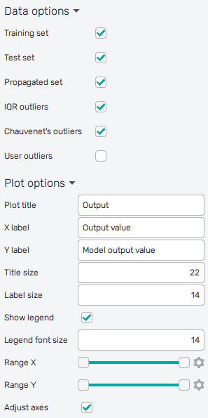
It is possible to select datasets included in the plot and to
adjust the appearance of the plot using controls from
the Data options and Plot options sections of the panel on the left:
-
Training set : Includes samples used to train the model into the plot.
-
Test set : Includes samples used to evaluate the quality of the model into the plot.
-
Propagated set : Includes samples of propagated data into the plot.
-
IQR outliers : Highlights samples marked as outliers according to the IQR criteria.
-
Chauvenet's outliers : Highlights samples marked as outliers according to Chauvenet's criteria.
-
User outliers : Highlights samples marked as outliers according to the user-defined threshold.
When turned on, a slider appears to set the threshold value. Users can adjust the value by dragging the slider's holder or by clicking on its scale. The value can be also set precisely using the ⚙ icon on the right of each slider. This opens a sub-dialogue with entry fields for writing exact values of range limits. These need to be confirmed with the Set button.
-
Reliability bounds : For each shown sample, an upper and lower reliability bound is also plotted. Bounds are generated
from a separate model of predicted local error. There are several options of the reliability model method that can be set in the Core Solver Setup GUI. -
Plot title : Displayed above the plot, Output by default.
-
X label : Label of the X axis, Output value or the selected input variable name by default.
-
Y label : Label of the Y axis, Model output value or Output value by default.
-
Title size : Size of the title font.
-
Label size : Size of the label font.
-
Show legend : Switching on/off the legend of the plot/the colorbar scale.
-
Legend font size : Size of the legend font.
-
Range X : Double-sided slider allowing to show a slice of the data in detail. Dragging one of the slider's points limits the depicted range of input or output value, one can move with the section along the X-axis by dragging the green bar of the slider (both edge points are highlighted).
-
Range Y : Double-sided slider allowing to show a slice of the data in detail. Dragging one of the slider's points limits the depicted range of output value, one can move with the section along the Y-axis by dragging the green bar of the slider (both edge points are highlighted).
All ranges in the plot can be also precisely using the ⚙ icon on the right of each slider. This opens a sub-dialogue with entry fields for writing exact values of range limits. These need to be confirmed with the Set button. Setting values outside the domain's boundaries will reset range limits to the default state.
-
Adjust axes : Toggle if the axis and/or colorbar limits of the plot should be only the range adjusted with the slider above (on) or the full range of the input distribution (off).
Error
The value of the error itself can be separately shown against the output or selected input variable. This plot gives further insight into the understanding of outliers. The vertical axis belongs to the value of error, horizontal lines represent criteria for outlier definition as mentioned in the Evaluation of error section.
The controls of the plot and export procedure of the picture are the same as for the Output plot.
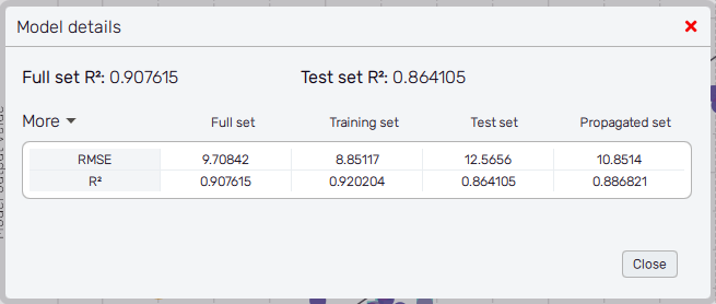
Model details
The "Model details" button in the sidebar shows a dialog with more detailed information about the model precision. For each displayed data set, there is a value of the R2 and RMSE metric.
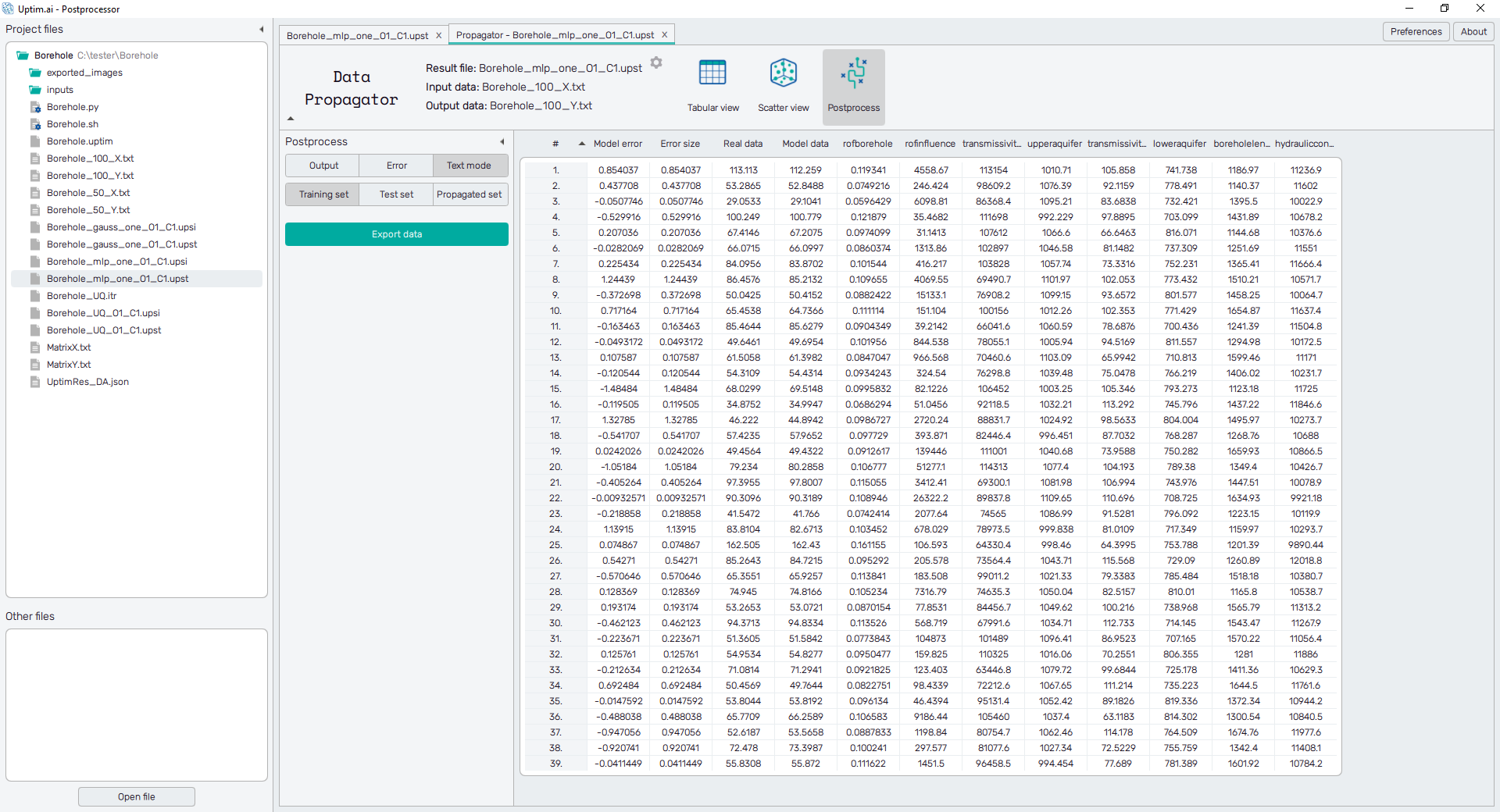
Text mode
Data from the iterative file are presented in the form of a spreadsheet, as shown in Figure 5. The table contains the complete info about the loaded data and the data used for training the model. For each sample, there are its coordinates in the input domain, output value loaded from the source and from the model, and the evaluation of error between real and model data. It is possible to change the sorting of the sheet (ascending or descending, where ascending is the default) by clicking on the row number, input variable name, error, or data.
For models created with the Data Analysis method,
three buttons on the left panel switch the spreadsheet content. The Training set shows
samples used for
the training of the model. The Test set is a group of samples selected
for evaluation of model quality after enhancement techniques of the Core Solver were used.
The third button labelled Propagated set represents the dataset propagated through the model.
Tables can be saved as *.csv files using the Export data button.
For models created with the Uncertainty Quantification method, there are no switches and only the data of the propagated set of samples is available.