Data Analysis
This is a basic tutorial of Uptimai software prepared to give a first introduction to the suite,
and how to run its different features. To complete this tutorial there will be needed the
Uptimai software and a *.zip file with some complementary files required for the example
problem to be solved. The Piston.zip file can be found inside Uptimai Member Area ->
Downloads -> Tutorial cases.
The *.zip file contains the whole project folder, so the user can start at any step of the given
tutorial. Nevertheless, if the user wants to fulfil the tutorial from the beginning, only the
set of *.txt files with input matrices will be necessary, as all the other files will be generated
during the process.
This tutorial will show you:
- How to start the project
- How to run each program of the package
- What are the main features of each program and how to use them
- What are the results you can expect
- How to export and store output data
- How to deal with the most common issues you can encounter during the process
Part 1: Launcher
1.1: Start the program
Open the Uptimai software. You can use the Start menu or desktop shortcut if this option was selected during the installation process, or find the executable inside the installation folder
1.2: Begin the project
Create a New Project. You will have to choose an empty folder where all the project files will be located. The name of the folder will become the name of the project, in this example, we will use the name Piston. You can create the folder directly from the interface.
Once you have created the project, an *.uptim file will appear inside your project folder.
That file is used as a flag so the folder is recognized as an Uptimai project, and contains
the information about already available sets of input files, setups, etc.
The basic rule for the
*.uptim file is the file name has to be the same as the name of the project folder.
1.3: Proceed to Tools
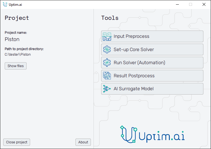
Now, you have access to all the different features that conform to the Uptimai suite. In this tutorial, we will use them one by one.
To switch between projects if needed, close the current one with the Close project button at the bottom left of the window and use the Open button of the Launcher (see Figure 1) to run another one.
Part 2: Input Preprocess
2.1: Open the Input Preprocessor tool
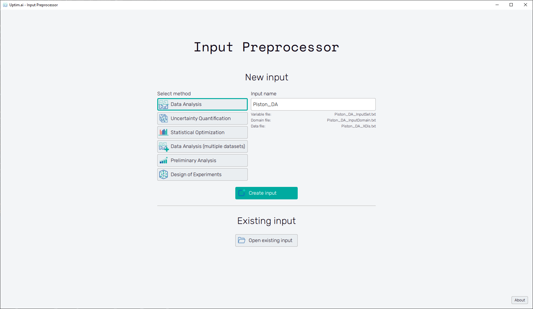
The first step of all projects is always the Input Preprocessor, which can be opened directly from the Launcher. The initial state can be seen in Figure 3. In this tutorial, we will use the Data Analysis method. It is possible to modify the Input name, but for simplicity, we will maintain the default name suggested by the software. Then, we can click the Create input button to start generating the set of input files.
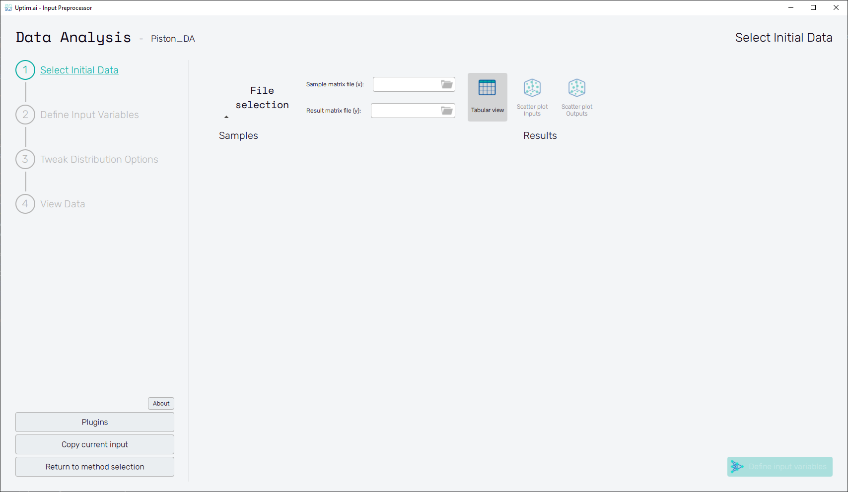
2.2: Select training data
When starting with the new set of inputs for the Data Analysis method, the process begins with
the Select Initial Data screen and its Tabular view feature. First, select files containing
input values and results of samples used for the training of the model. Clicking the folder icon
in the Sample matrix file (x) entry opens the file dialogue where you can pick the file
Piston-matrix_X.txt. Do the same for the Result matrix file (y) and Piston-matrix_Y.txt file.
Tables with values will show immediately after the selection.
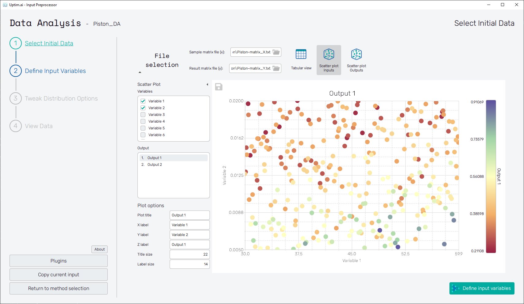
2.3: Scatter plots of Inputs
Visualize the distribution of loaded samples in the domain with the Scatter plot Inputs feature. Select one or a combination of two Variables to see if the input domain is covered evenly. Seek for outliers, isolated clusters of samples, and correlated Variables.
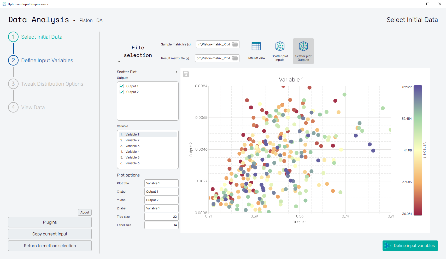
2.4: Scatter plots of Results
Visualize the distribution of loaded results in the Scatter plot Outputs feature. Select one or a combination of two Outputs to see if the range of results is covered evenly. Seek for clusters of samples and outliers. Switch Variable to see the possible connections of e.g. extremities in results and input values.
2.5: Define Input Variables
Using the Define Input Variables button in the bottom right of the screen or the item of the fishbone navigation bar on the left switch to the Define Input Variables screen. Here you will complete the input variable information.
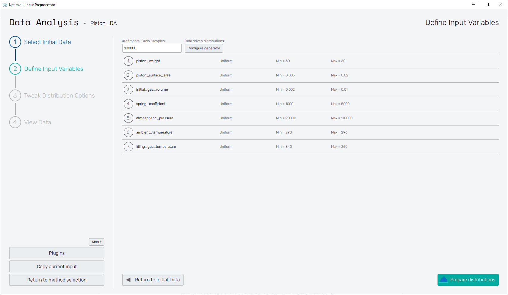
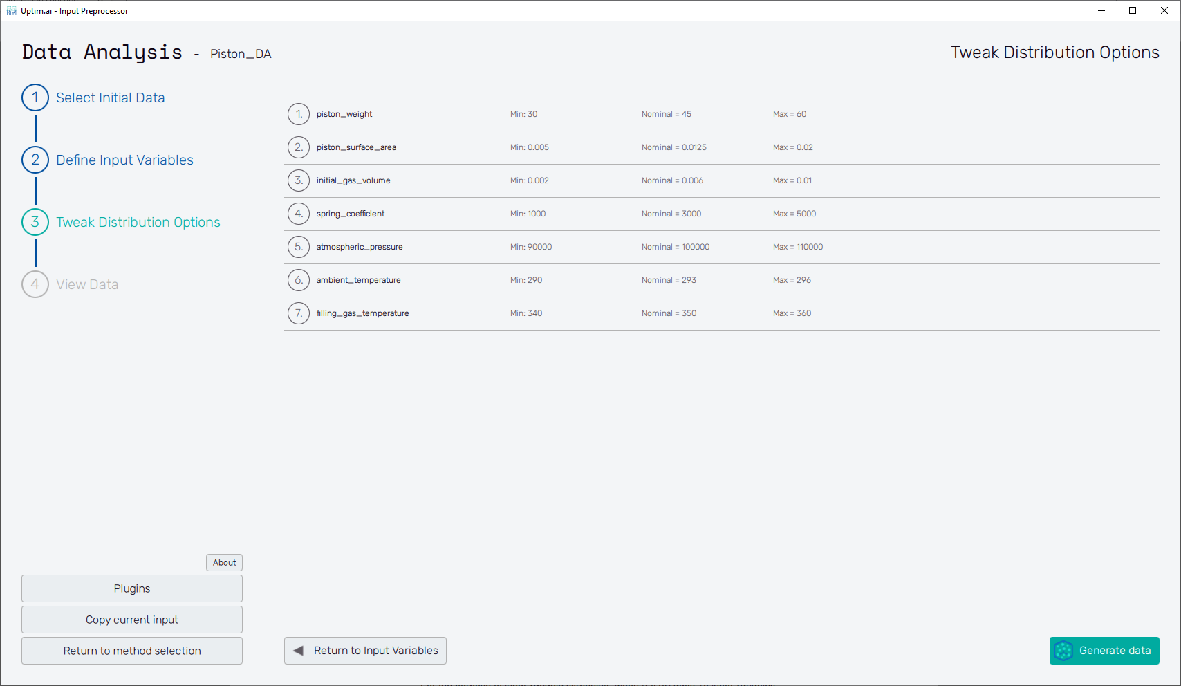
Unlike the Uncertainty Quantification method, here you cannot change the number of input variables. This is strictly given by the number of columns in the file with training samples loaded in step 2.1. By default, uniform probability is set for all input variables with minimum and maximum limits being minimum and maximum values of loaded samples. Adjust the names of variables and ranges of input values as in the table below. Do not forget to Confirm all changes with the button.
Open to view Input Distributions
| Name | Type | Parameter 1 | Parameter 2 |
|---|---|---|---|
| piston_weight | Uniform | 30.0 | 60.0 |
| piston_surface_area | Uniform | 0.005 | 0.02 |
| initial_gas_volume | Uniform | 0.002 | 0.01 |
| spring_coefficient | Uniform | 1000.0 | 5000.0 |
| atmospheric_pressure | Uniform | 90000.0 | 110000.0 |
| ambient_temperature | Uniform | 290.0 | 296.0 |
| filling_gas_temperature | Uniform | 340.0 | 360.0 |
2.6: Prepare distributions
With all input variables defined completely, pre-generate random distributions of samples that will be later used for statistical analysis and visualizations. You can set the number of generated samples in the # of Monte-Carlo Samples entry at the top of the screen.
The Prepare distributions button will generate all distributions according to the setting and then morph into the Tweak distribution options button.
2.7: Tweak Distribution Options
The Tweak distribution options button in the bottom right of the screen or the item of the fishbone navigation bar on the left switches to the Tweak Distribution Options screen. Boundaries of input distributions are adjusted here as well as the position of the nominal sample.
By default, the nominal sample position is set to be the mean value of each input distribution. It is recommended to keep in not further from this point than 10% of the input distribution range. All input files are created and saved upon the Generate data button clicking. Then, this button's label turns to View data histogram and the following section becomes accessible.
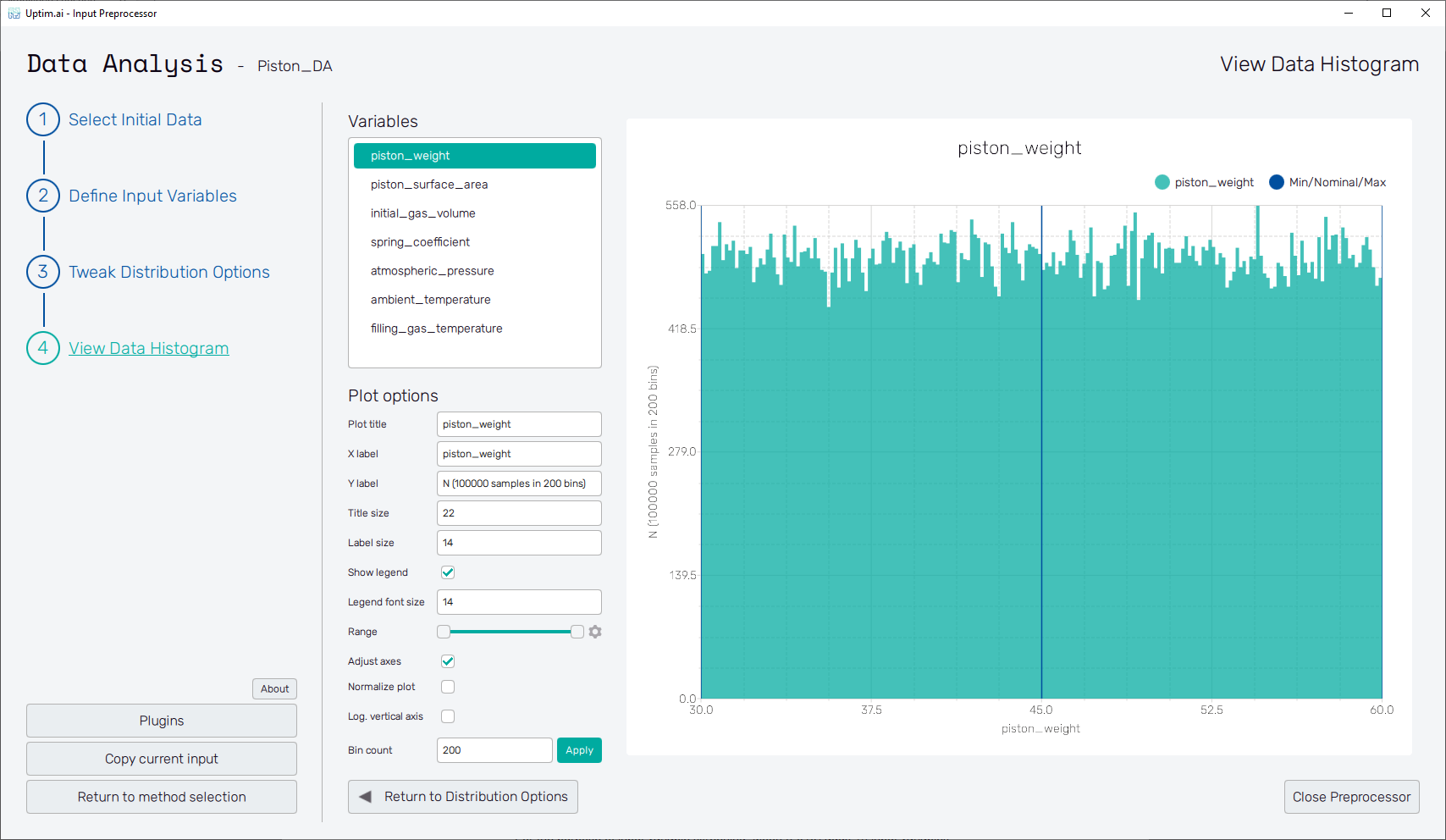
2.8: View Data Histogram
Clicking the View Data Histogram button in the bottom right of the screen or the item of the fishbone navigation bar on the left shows the View Data Histogram screen. Check that the histograms presented for each Variable are the probability distributions wanted. You can style the plot using the Plot options section. Clicking points of interest in the plot shows the pop-up with details. Close Preprocessor button ends the current program.
Part 3: Set up the Core Solver
3.1: Start the setup GUI
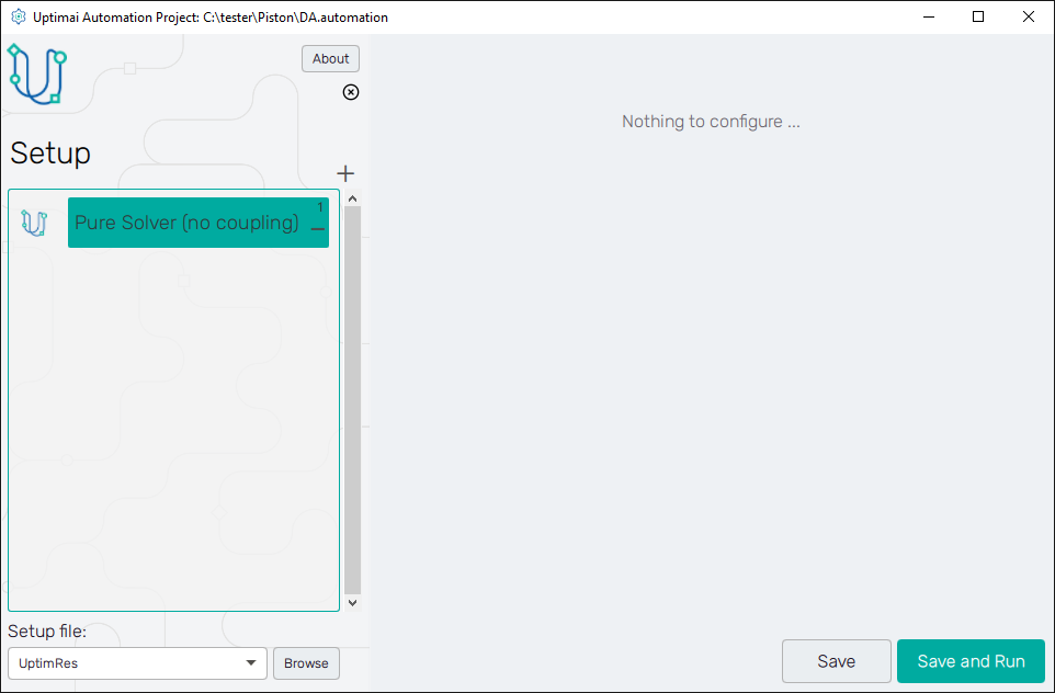
Once the inputs have been generated, it is time to prepare all the settings for the solver. We can do that using the Core Solver Setup, which once opened from the Uptimai main interface has the appearance as shown in Figure 10.
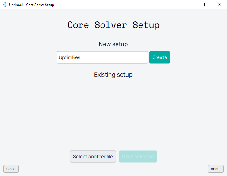
3.2: Create new setup
Once the program is opened, the first thing we need to do is to create a new setup file. We can maintain the name of the file to the default value of UptimRes and then just click on the Create button.
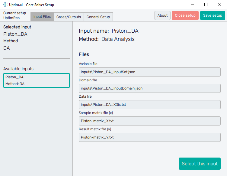
3.3: Select the set of inputs
Then, we will see that the Core Solver Setup has three
main tabs. The first one is to select the input files that will be used in this run.
In our case, we want to use the set of inputs prepared for the
Data Analysis method.
3.4: Set up the case
The second tab, which is Cases / Outputs, details all the settings that are used for tuning the core solver to the needs of each specific problem. Thus, there is a setup specific to the Data Analysis method we are working with. Also, there is information about which outputs we would like to study. Only the Output 1 is present at the start. For demonstration purposes, turn on the Trend model and the Enhanced model. You can leave all the other parameters set to the default.
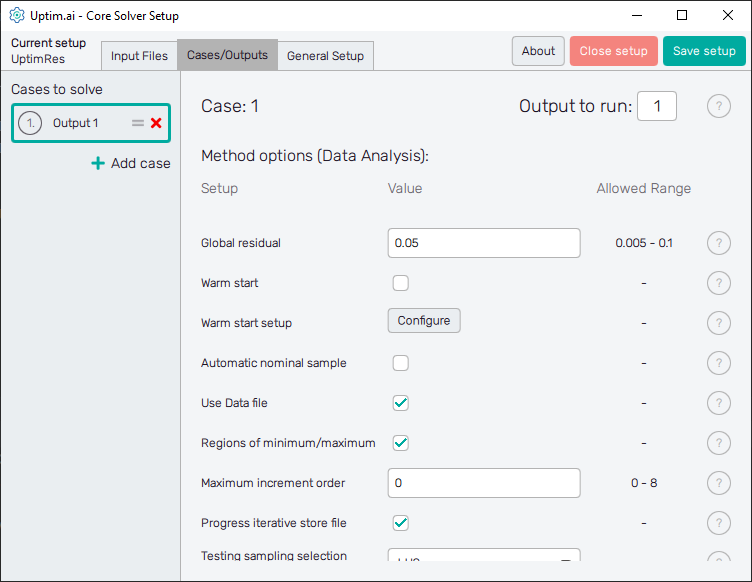
3.5: Add one more case
Click the + Add case icon at the bottom of the Cases to solve list that can be found in the left section of the program window. Change Output to run value of this newly created Case 2 to .
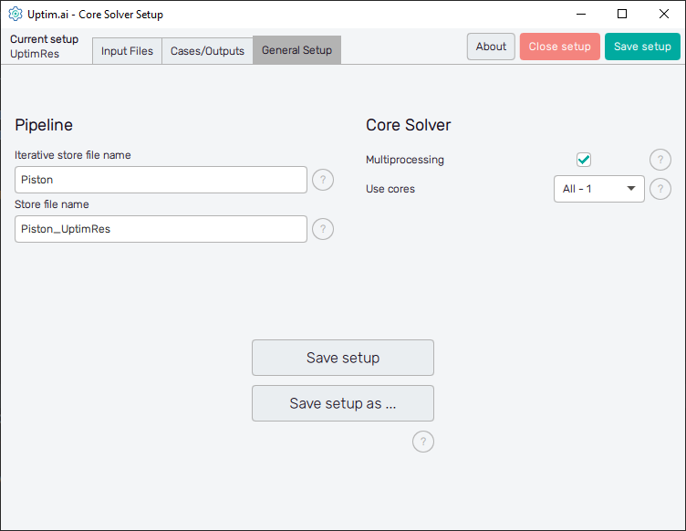
3.6: General setup
Finally, in the third tab, there is information regarding naming and other solver aspects. In
this case, we don’t need to modify anything, and we can directly save the setup. When we do that,
an UptimRes.json file will be generated in the project folder containing all the information
that we saved. That file will be used by the solver itself.
Part 4: Run Solver (Automation)
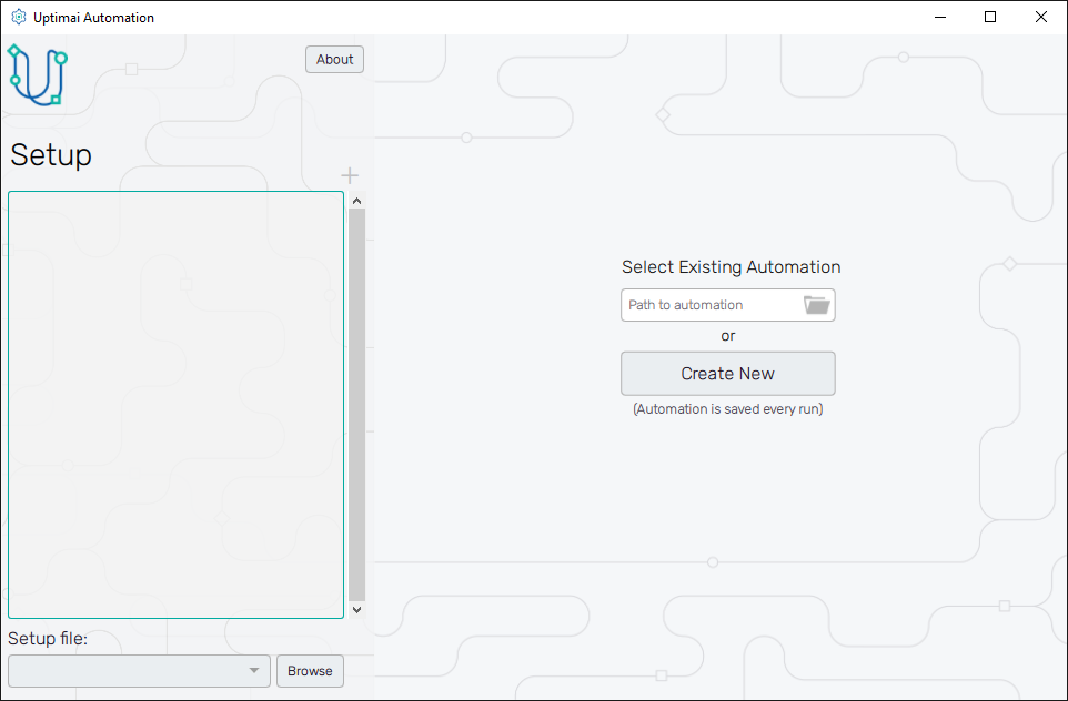
4.1: Create new automation configuration
Now it is time to open the Run Solver (Automation) from the Uptimai main interface. We will create a new automation file using the New automation section of the screen. Here, choosing any name and clicking the Create button stores the newly created file in the project folder. In case you want to load a previously created session, select one item from the list of the Existing automation section and confirm with the Open selected button. Eventually, you can search for any automation session under the Select another file button.
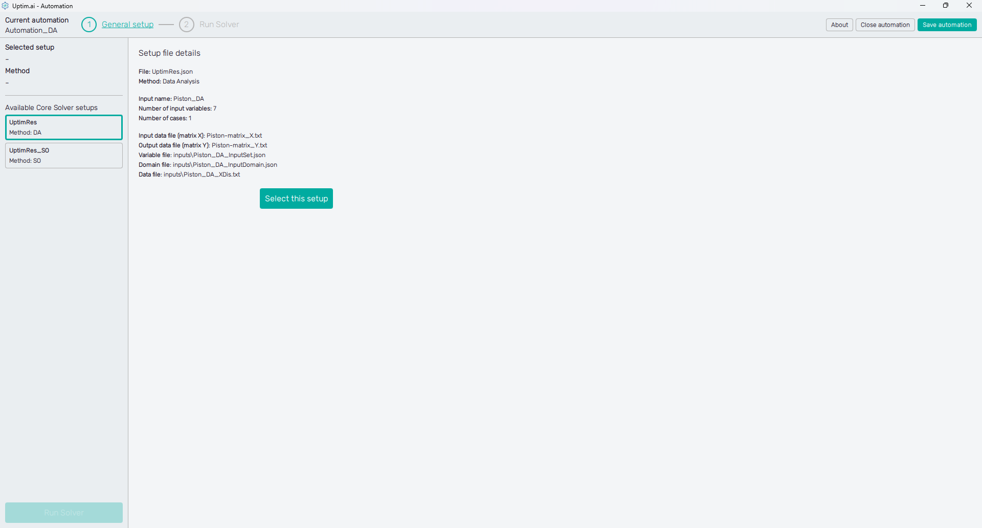
4.2: Select the Solver setup
The first important thing to do is to select the setup you've created in Part 3 of the tutorial. Our setup file UptimRes should be in the list of Available Core Solver setups shown on the left panel of the screen. The method 'DA' (as Data Analysis) was identified automatically to make the navigation through list items easier. Once the setup item is clicked, you can see the Setup file details. Then, confirm the selection with the Select this setup button.
4.3: Core Solver settings
The Core Solver settings is a simple task in this case. We recommend turning on the console output saving that stores the log of the Core Solver. There is no need to modify the advanced settings.
In this stage, the Run Solver button is active as well as the Run Solver item of the fishbone navigation bar at the top of the screen. Both of them lead to the next step.
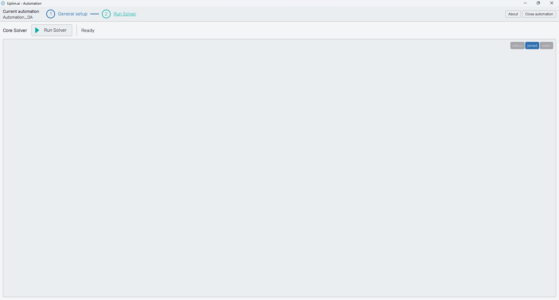
4.4: Run the Solver
As you can see at the top of the screen right under the fishbone navigation bar there is the Run Solver button with the status bar right next to it, saying Ready at the moment. Clicking the button runs the Core Solver that builds the mathematical model. The program will show the process log on the screen. Once the solver is running, the main button turns red, labelled Stop Solver until the mode is ready. This will be indicated by the 'Everything finalized' message at the end of the log.
Part 5: Result Postprocess
5.1: Open the Postprocessor
To see the results, we will open the Postprocessor from the Uptimai main interface.
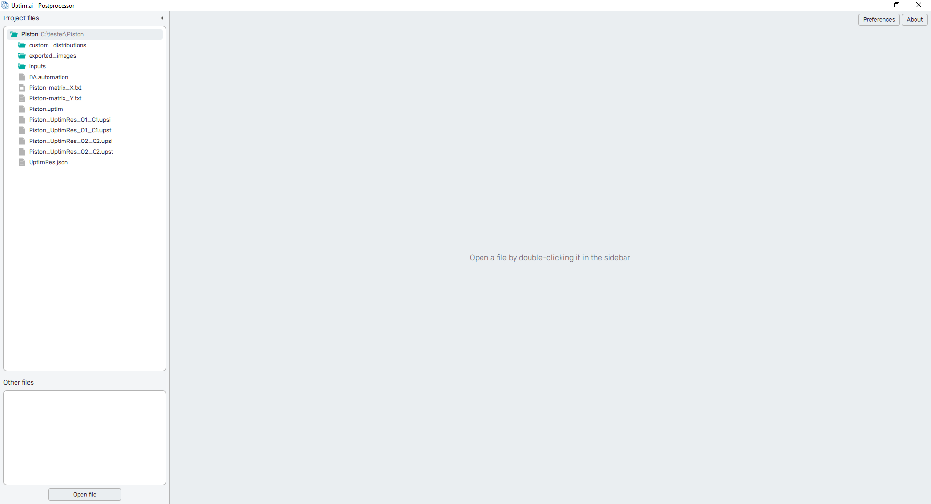
Now we will open the model for the first output, opening the
Piston_UptimRes_O1_C1.upst file.
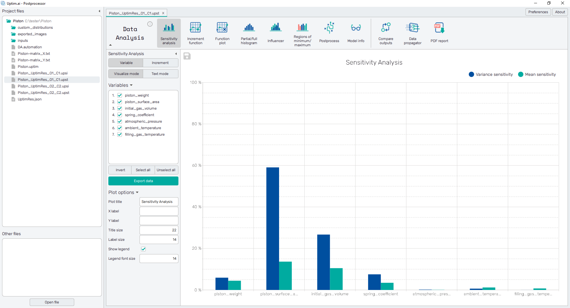
5.2: Sensitivity analysis
In the top section, we have all the features available, we will start with the Sensitivity analysis, which shows which variables are more important. In this case, we can easily see that variables atmospheric_pressure, ambient_temperature and filling_gas_temperature are irrelevant and can be neglected from the study. Also, if we switch the sensitivity analysis to Increment we can see not only the importance of variables, but if they are important by themselves or by interacting with other variables. In this case, the interactions don’t have a huge impact on the results. Save the plot with the 💾 icon on its upper left.
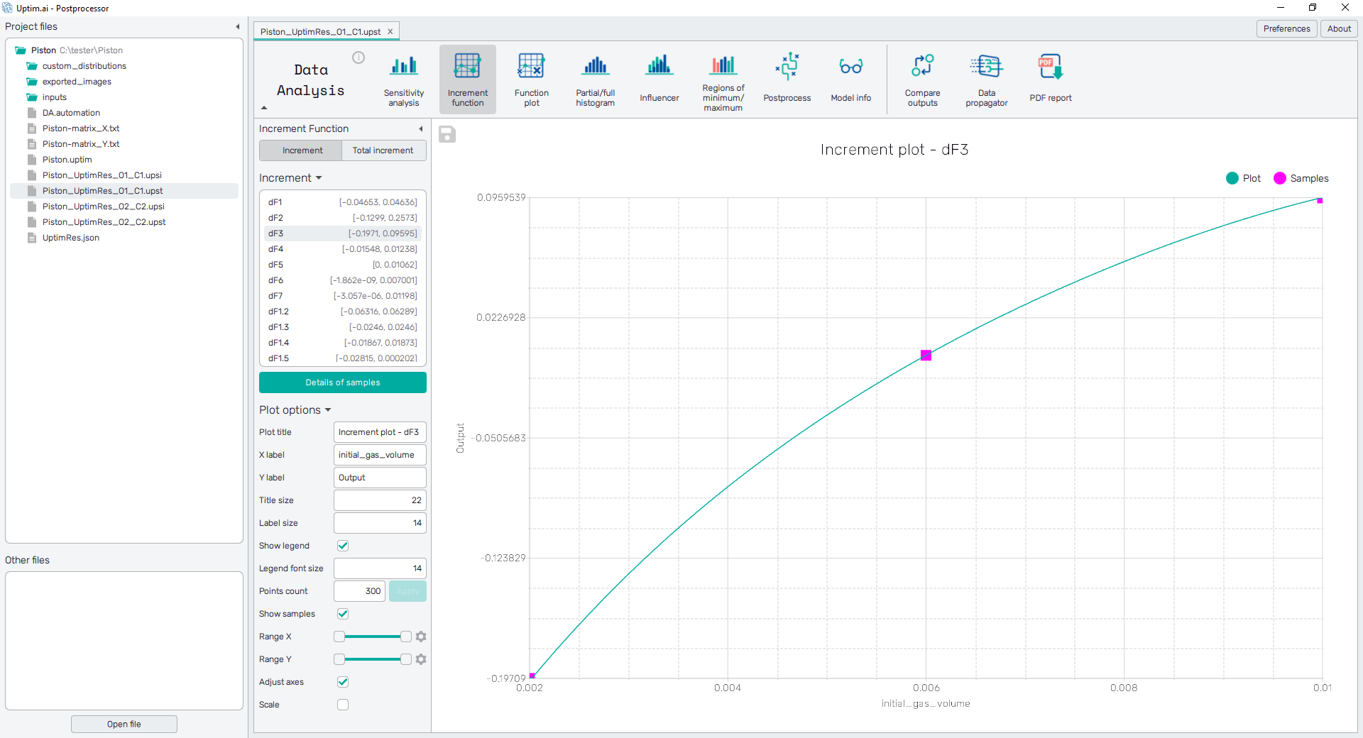
5.3: Increment function
In the Increment Function, we can see the independent effect of each increment, to understand how they are affecting the output and in which zones we want to be to optimize the solution.
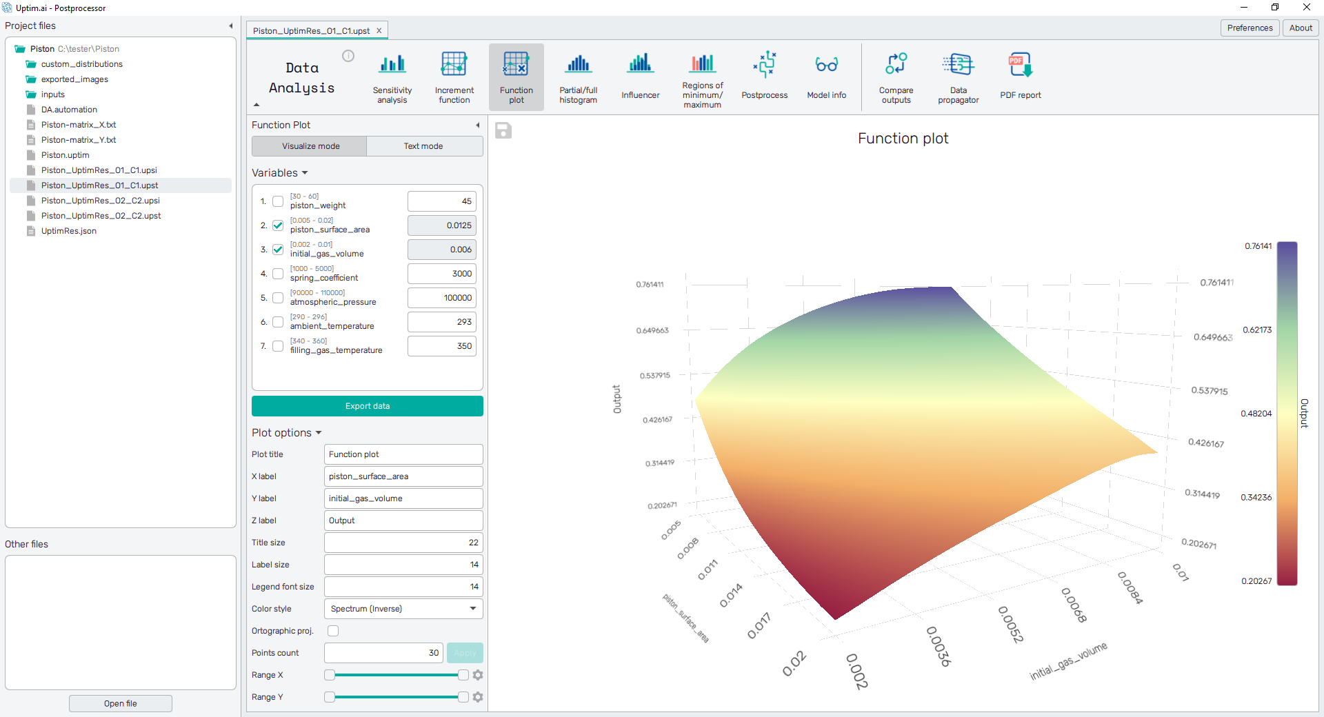
5.4: Function plot
In the Function plot, it is depicted the AI surrogate model so the user can extract the exact expected output for any possible combination of inputs. We can use both the Visualization mode and the Text mode. Select up to three Variables from the list and change the values of the others to see a particular cut through the domain.
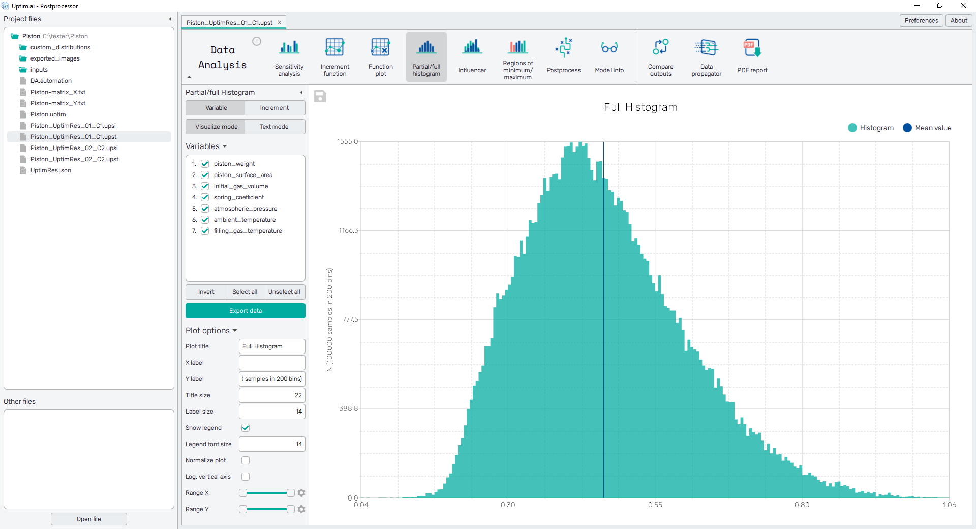
5.5: Histogram plot
With the Partial/Full histogram, we can see the probability distribution of the output, to be able to see what are the expected zone of results given all the uncertainty from the inputs. Also, these can be shown for any combination of input variables or increment functions present in the model. Switch between these with controls in the panel on the left. Try to Export data of the source Monte Carlo matrix, you can see it also in the Text mode.
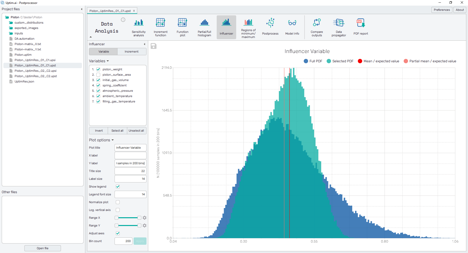
5.6: Influencer
With the Influencer, we can go a step further and discover how every variable or increment is actually affecting the output distribution, to understand how we can tune our problem to reduce the variability of the results in a desired way. See the difference between the full probability density function (PDF) and the PDF where the uncertainty of particular variable(s) or increment function(s) is neglected.
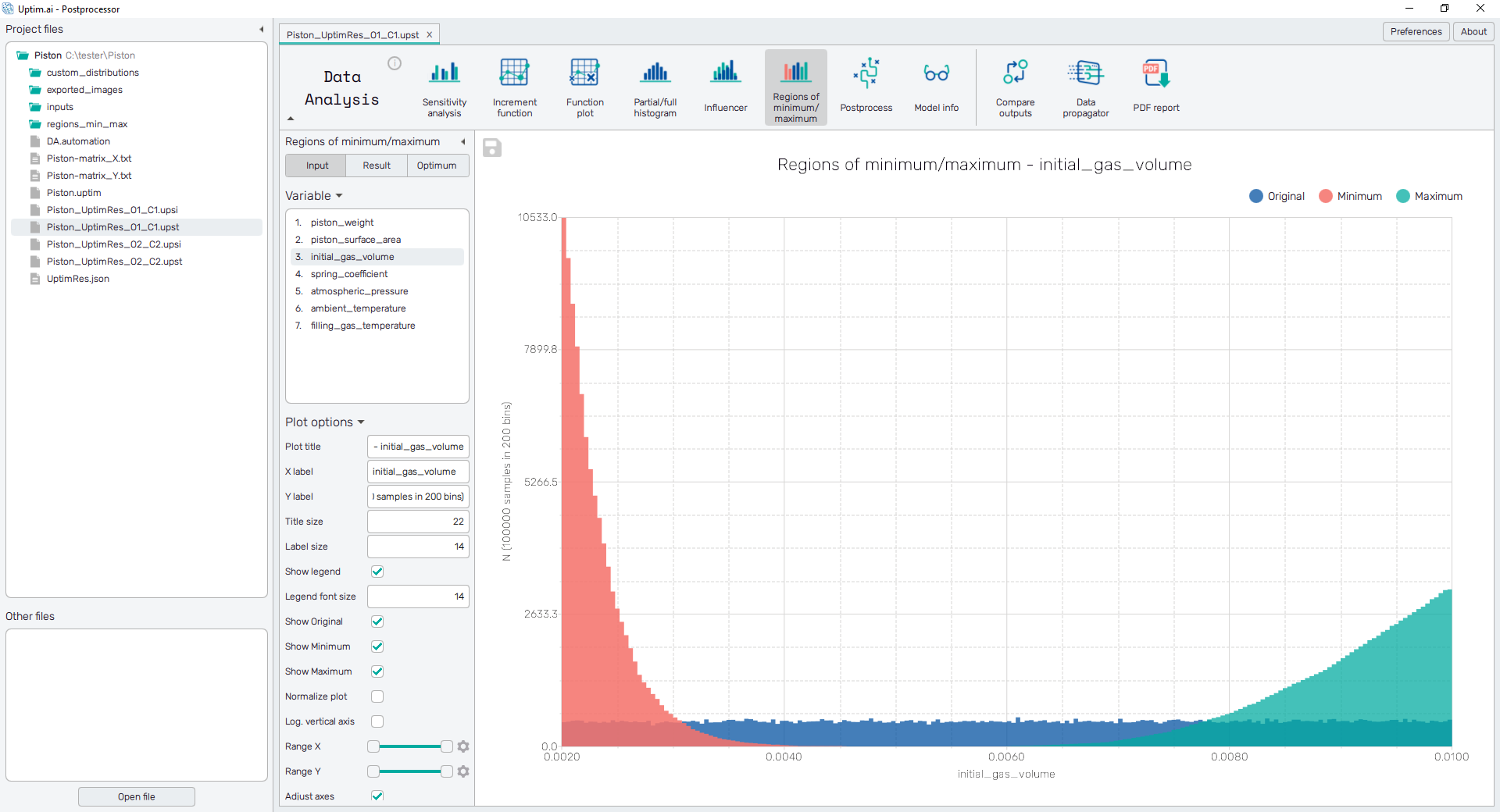
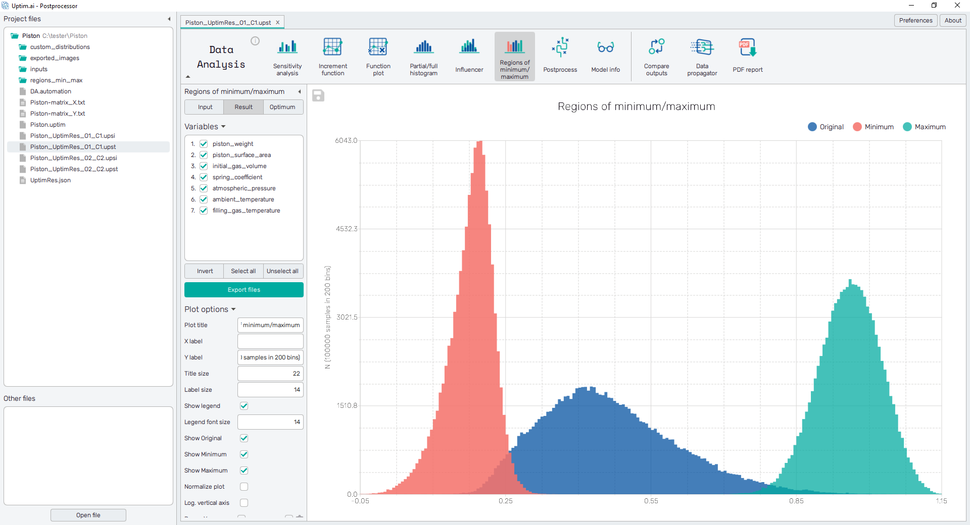
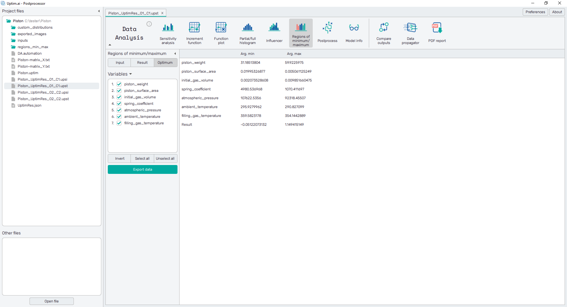
5.7: Regions of minimum/maximum
Finally, with the Regions of minimum/maximum, the software is doing a statistical optimization analysis. The Input option shows in which zones you should be from your original input distribution, no matter the uncertainties of the other variables have a statistical improvement on the output (to go to the maximum or the minimum).
The Result option allows us to see which would be the expected result if the presented new input distributions were considered.
Finally, in the Optimum option, the software is showing what is the absolute maximum and the absolute minimum found with a Monte Carlo approach, and where it is located. Save the table using the Export data button.
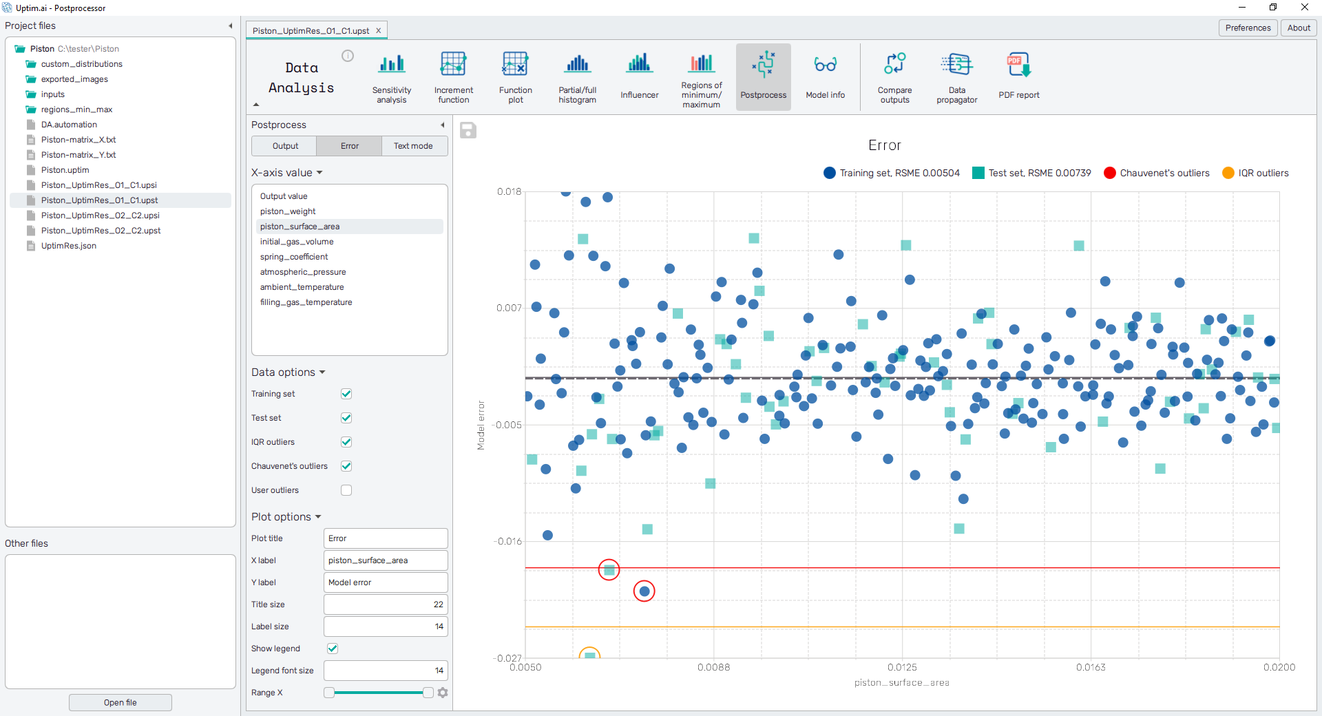
5.8: Postprocess
It is always necessary to assess the reliability of the models we are working with. Therefore, we will use the Postprocess feature to evaluate the correlation of the real Output value and the approximated Model output value. In the figure below, focus especially on the turquoise squares of the Test set. These are samples unknown and not used in the process of learning the model, thus, they are suitable for model validation.
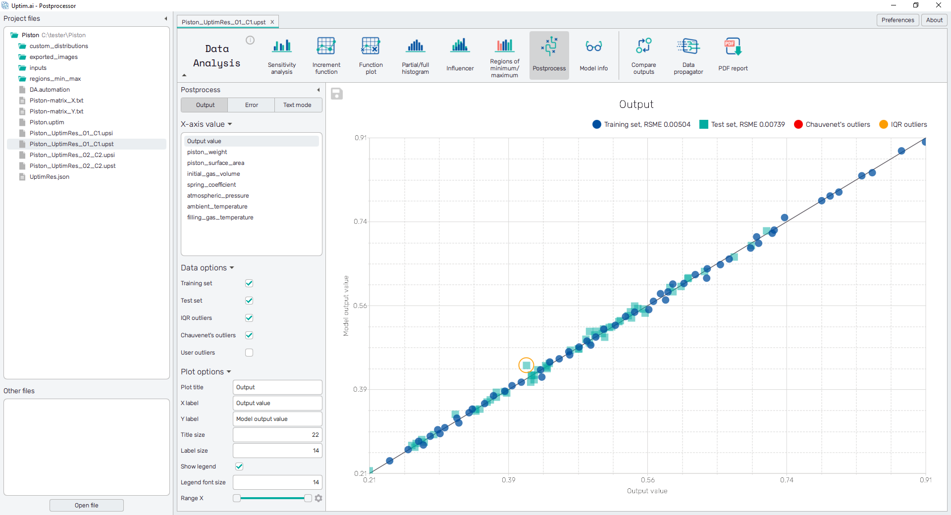
Check for the circled outliers. Switch between Variables to identify ranges of input variables associated with outlying output values. By changing the screen from Output to Error, you will directly see the difference between the model from the expected value of output.
Part 6: Comparison of outputs
Although the Compare outputs feature is included in the Postprocessor program, let's dedicate a separate section to it.
6.1: Select file for comparison
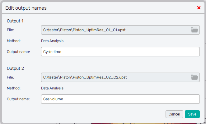
Click the Compare outputs icon to open the pop-up window where you will choose files for
comparison. The already opened model is preselected as the Output 1. Through the entry
field and the file dialogue find the file Piston_UptimRes_O2_C2.upst that will become
the Output 2. You can also change the names of outputs to their physical meaning - Cycle time
and Gas volume.
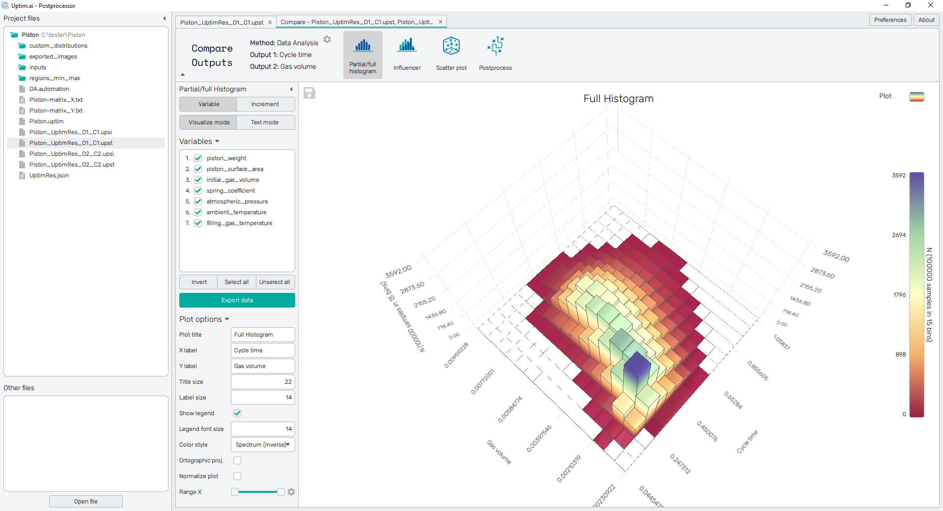
6.2: Histogram plot
With the Partial/Full histogram, we can see the probability distributions of both outputs, to be able to see what are the expected zones of results given all the uncertainty from the inputs. Also, these can be shown for any combination of input variables or increment functions present in the model. By switching input variables on/off you can notice those responsible for the correlation of outputs.
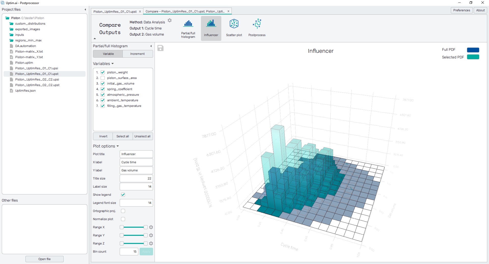
6.3: Influencer
With the Influencer, we can go a step further and discover how every variable or increment is actually affecting the correlation of output distributions, to understand how we can tune our problem to reduce the variability of the results in a desired way or e.g. suppress the correlation of outputs.
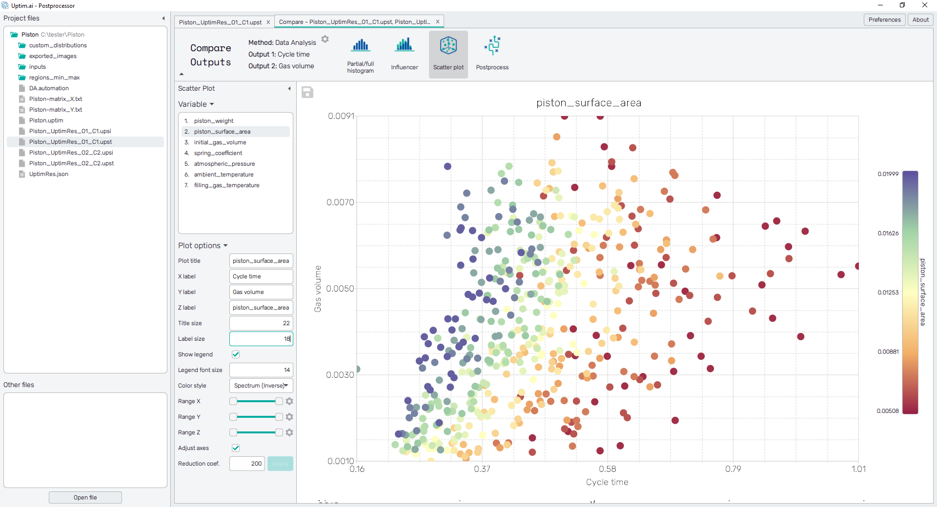
6.4: Scatter plot
Visualize how approximated Monte Carlo samples are distributed across ranges of both outputs. Switch the active input Variable to see how are their values associated with particular output values. It is an additional visual confirmation of the validity of trends identified previously in Regions of minimum/maximum.
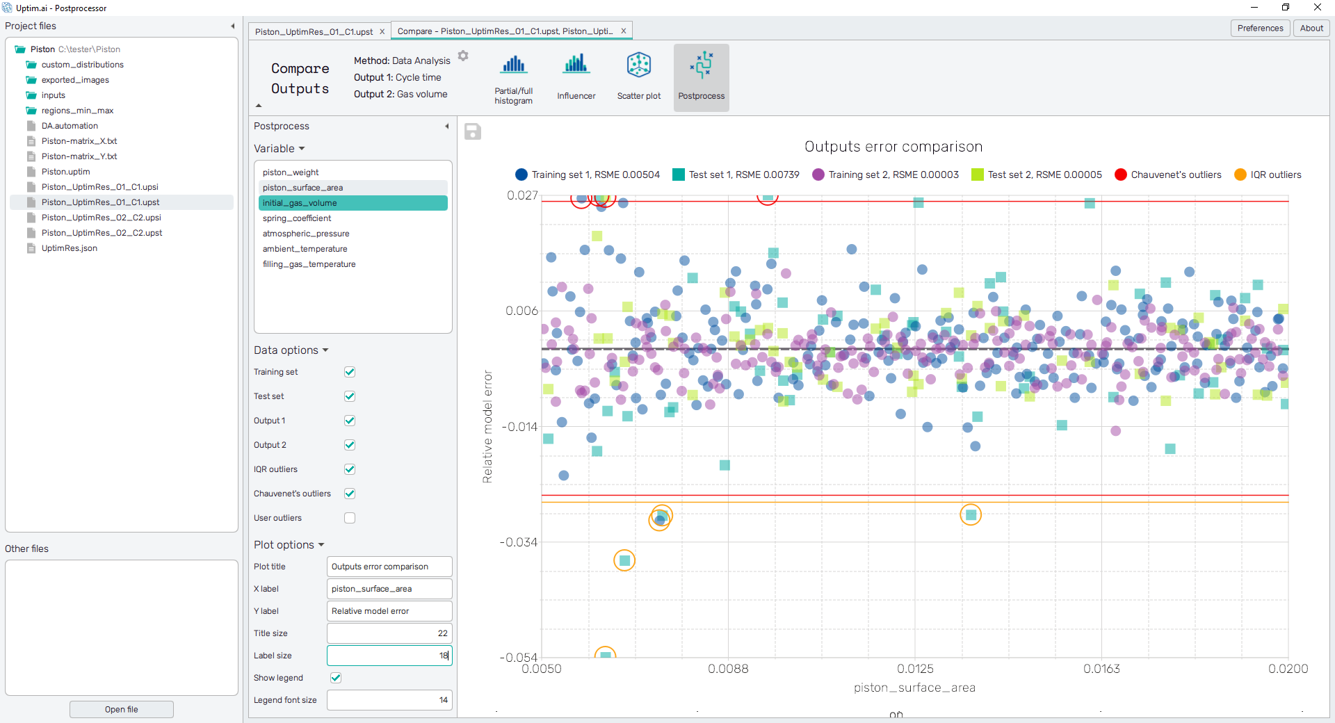
6.5: Postprocess
The modified Postprocess feature enhances the correlation evaluation of the real Output value and the approximated Model output value. It displays the error samples of the Training set and the Test set for both outputs together in one plot. Seek for similarities in the location of outliers.
Check for the circled outliers. Switch between Variables to identify ranges of input variables associated with outlying output values. Optimally, these originate from the same ranges of input values. By changing the screen from Output to Error, you will directly see the difference between the model and the expected value of output.