Influencer
A histogram is a representation of the distribution of numerical data. It is an estimate of the probability distribution for an uncertain output/s. A histogram is well-known and understood. However, our approach allows something we call partial histograms. These partial histograms represent a partial part of the final histogram and their sum creates the final histogram. This allows visualizing how each part of the variable influences the final distribution.
Influencer compares the final distribution against a distribution with several increment functions/variables neglected from the final model. This allows a comparative visualization of the influence of the selected increment functions/variables and focuses on the right aspects of the problem. For a better perspective, the final Probability Distribution Function is visualized in the background.
Furthermore, with this tool is possible not only to see the influence on one output, but compare the probabilistic distributions of two outputs in order to understand the relation between themselves and lead to an improvement of different characteristics at the same time.
How to use the interface
First, to use this feature it is necessary to access the Compare Outputs suite as explained in the section Home screen.
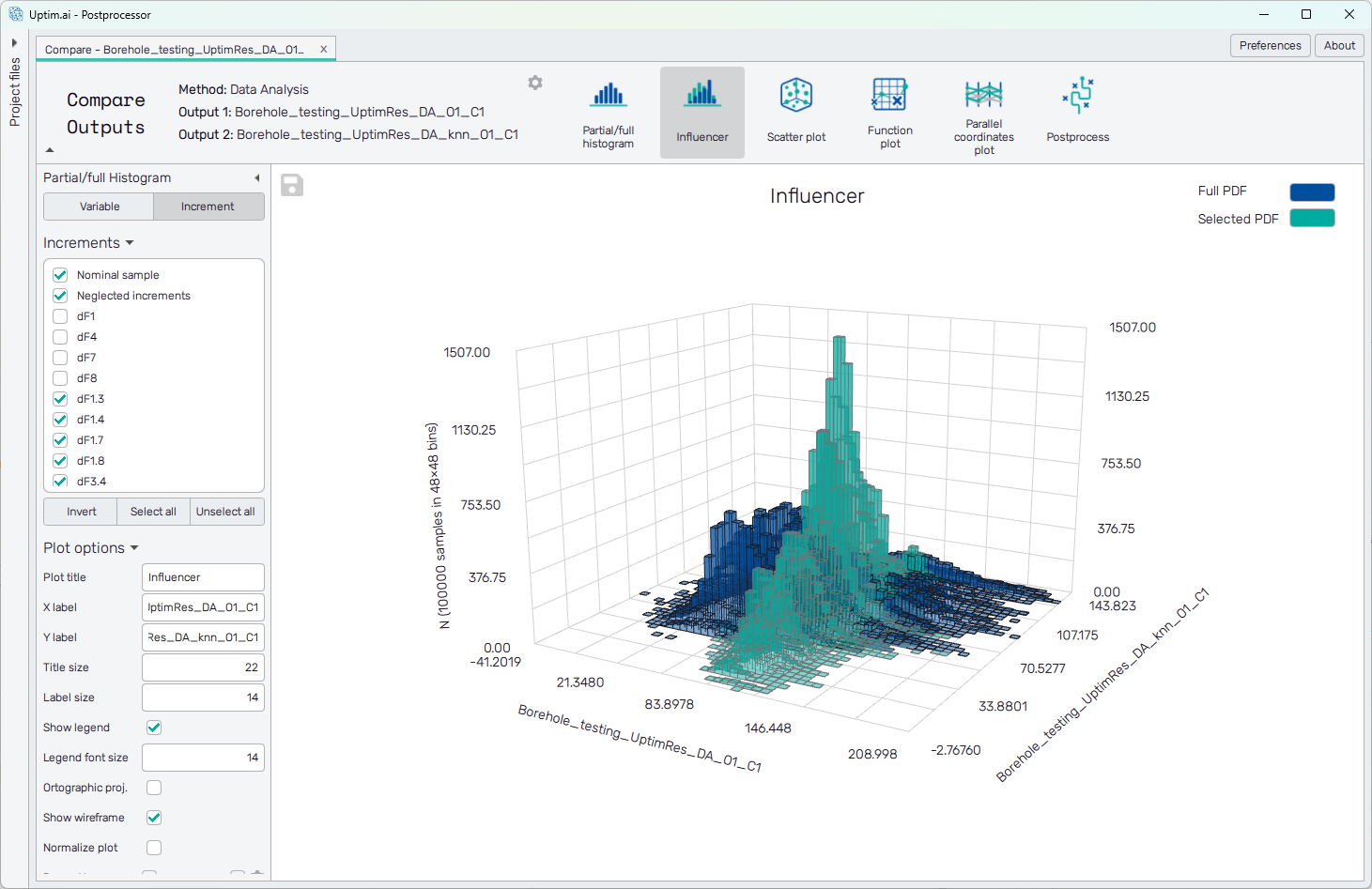
The tab under Influencer allows the user to change from variable to increment to display the different possibilities for partial histograms. It is the same structure as in Influencer but for two outputs at the same time.
The table under the tab refers to the variables/increments present on the models, from which the user can select which wants to visualize.
To export the plot as a .png or .jpg file, the save-file dialogue can be induced
by clicking the 💾 icon on the top left of the plot.
It is possible to adjust the appearance of the plot using controls from
the Plot options section of the panel on the left:
-
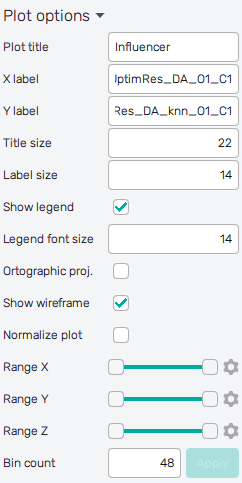
Plot title : Displayed above the plot, input variable name by default.
-
X label : Label of the X axis, name of the Output 1 by default.
-
Y label : Label of the Y axis, name of the Output 2 by default.
-
Title size : Size of the title font.
-
Label size : Size of the label font.
-
Show legend : Switching on/off the legend of the plot.
-
Legend font size : Size of the legend font.
-
Color style : Selection menu setting the colormap of input variable values.
-
Orthographic proj. : Switch between orthographic (on) and perspective (off) projection of the 3D plot.
-
Show wirefarme : Enables/disables wireframe.
-
Normalize plot : Normalization of histogram plot, toggle on/off.
-
Range X : Double-sided slider allowing to show a slice of the data in detail. Dragging one of the slider's points limits the depicted range of bins, one can move with the section along the X-axis by dragging the green bar of the slider (both edge points are highlighted).
-
Range Y : Double-sided slider allowing to show a slice of the data in detail. Dragging one of the slider's points limits the depicted range of bins, one can move with the section along the Y-axis by dragging the green bar of the slider (both edge points are highlighted).
-
Range Z : Double-sided slider allowing to show a slice of the data in detail. Dragging one of the slider's points limits the depicted number of samples/density in a bin, one can move with the section along the Z-axis by dragging the green bar of the slider (both edge points are highlighted).
All ranges in the plot can be also precisely using the ⚙ icon on the right of each slider. This opens a sub-dialogue with entry fields for writing exact values of range limits. These need to be confirmed with the Set button. Setting values outside domain's boundaries will reset range limits to the default state.
-
Bin count : Set the number of bins in each dimension of the histogram. The recommended value is below 15. Needs to be confirmed with the Apply button.