Scatter plot
The Scatter Plot feature shows the plot of the relation between input variable values and corresponding output values. This gives the user a quick graphical reference about the statistical distribution of both outputs regarding specific values of the inputs, and the correlation between both outputs.
How to use the interface
First, to use this feature it is necessary to access the Compare Outputs suite as explained in the section Selection of files. Data of the expected value for both outputs (interpolated with the AI Surrogate Model) is presented in the form of a scatter plot with the specific relation with one input , as shown in Figure 1. For the setup of the plot, on the left side, there is a clickable list of the input variables. Selected input defines against which input the correlation of outputs is depicted, as well as the color scale of the plot and the color of each depicted sample. Each output is represented independently in each axis of the plot.
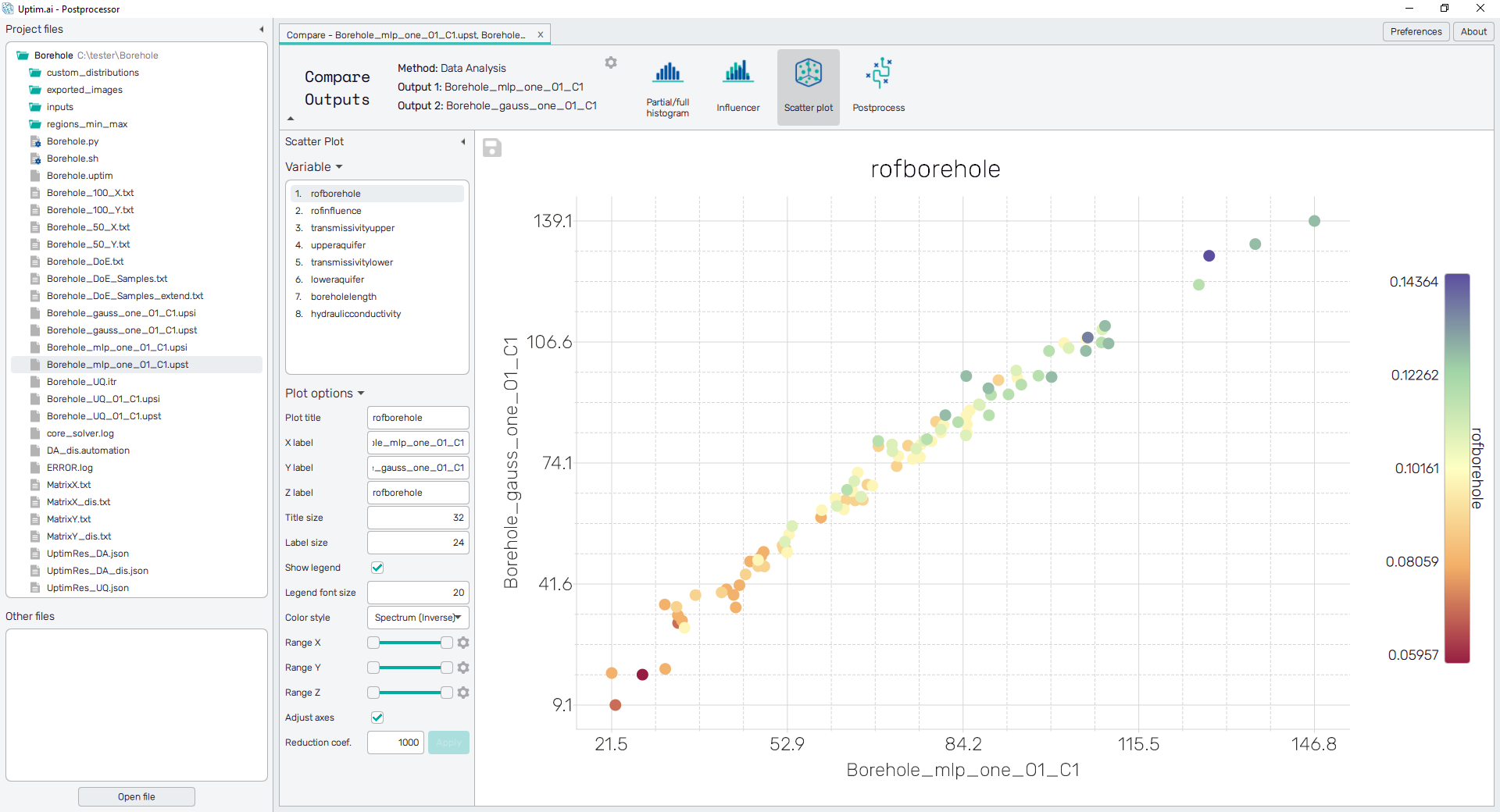
To export the plot as a .png or .jpg file, the save-file dialogue can be induced
by clicking the 💾 icon on the top left of the plot.
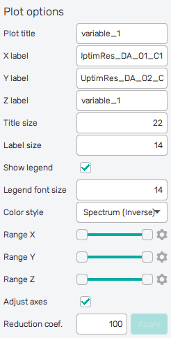
It is possible to adjust the appearance of the plot using controls from
the Plot options section of the panel on the left:
-
Plot title : Displayed above the plot, input variable name by default.
-
X label : Label of the X axis, name of the Output 1 by default.
-
Y label : Label of the Y axis, name of the Output 2 by default.
-
Z label : Label of the colorbar/function value scale, input variable name by default.
-
Title size : Size of the title font.
-
Label size : Size of the label font.
-
Show legend : Switching on/off the legend of the plot/the colorbar scale.
-
Legend font size : Size of the legend font.
-
Color style : Selection menu setting the colormap of input variable values.
-
Range X : Double-sided slider allowing to show a slice of the data in detail. Dragging one of the slider's points limits the depicted range of output value, one can move with the section along the X-axis by dragging the green bar of the slider (both edge points are highlighted).
-
Range Y : Double-sided slider allowing to show a slice of the data in detail. Dragging one of the slider's points limits the depicted range of output value, one can move with the section along the Y-axis by dragging the green bar of the slider (both edge points are highlighted).
-
Range Z : Double-sided slider allowing to show a slice of the data in detail. Dragging one of the slider's points limits the depicted range of input variable value, one can move with the section along the range of the input by dragging the green bar of the slider (both edge points are highlighted).
All ranges in the plot can be also set precisely using the ⚙ icon on the right of each slider. This opens a sub-dialogue with entry fields for writing exact values of range limits. These need to be confirmed with the Set button. Setting values outside domain's boundaries will reset range limits to the default state.
-
Adjust axes : Toggle if the axis and/or colorbar limits of the plot should be only the range adjusted with the slider above (on) or the full range of the input distribution (off).
-
Reduction coefficient : Variable that reduces the total number of samples that are plotted for an easier interpretation of results. If set to , the whole set of Monte Carlo samples specified in the Input Preprocessor will be depicted.