Convergence Properties
This page summarizes the convergence of the optimization process. It shows the convergence rate in each iteration of the process for the individual input variables. The convergence rate is computed differently, depending on the selected optimization method. The following table breaks down the convergence rate for each kind of optimizer which may be used to optimize a decoupled sub-problem:
| Optimizer | Convergence rate |
|---|---|
| Differential Evolution | The averaged standard deviation of the population coordinates. |
| CMA-ES | The averaged standard deviation of the population coordinates. |
| Golden-Section Search | Distance between the lower and the upper boundary. |
| Nelder-Mead | The averaged standard deviation of the simplex vertices. |
How to use the interface
On the left side, there is a sidebar where the user can configure the data view. The user can switch between the Visualize mode and Text mode.
The Variable menu allows to choose the input variable to visualize.
Also, the "Export data" button is always visible. It allows to save the data in the text/CSV format.
Text mode
The convergence rates in each iteration, for the selected input parameter, are presented in the form of a table. It is possible to sort the table (ascending/descending) by clicking the column headers. The current sorting is indicated by an arrow next to the column header.
Visualize mode
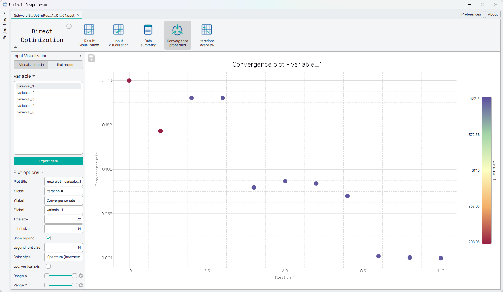
The convergence rates are presented in the form of a scatter plot (shown in Figure 1). The X-axis represents the iteration number. The Y-axis shows the convergence rate. Finally, the coloring of the markers in the scatter plot represents the value of the selected input parameter in the optimal sample known in each iteration.
The plot has the following configuration options, also found in the sidebar:
-
Plot title : Displayed above the plot.
-
X label : Label of the X axis.
-
Y label : Label of the Y axis.
-
Z label : Label of the Z axis (represented by color, shown on the right side of the plot).
-
Title size : Size of the title font.
-
Label size : Size of the label font.
-
Show legend : Switching on/off the legend of the plot/the colorbar scale.
-
Legend font size : Size of the legend font.
-
Color style : Selection menu setting the colormap.
-
Range X : Double-sided slider allowing to show a slice of the data in detail. Dragging one of the slider's points limits the depicted range of output value, one can move with the section along the X-axis by dragging the green bar of the slider (both edge points are highlighted).
-
Range Y : Double-sided slider allowing to show a slice of the data in detail. Dragging one of the slider's points limits the depicted range of output value, one can move with the section along the Y-axis by dragging the green bar of the slider (both edge points are highlighted).
-
Range Z : Double-sided slider allowing to show a slice of the data in detail. Dragging one of the slider's points limits the depicted range of input variable value, one can move with the section along the range of the input by dragging the green bar of the slider (both edge points are highlighted).
tipAll ranges in the plot can be also set precisely using the ⚙ icon on the right of each slider. This opens a sub-dialogue with entry fields for writing exact values of range limits. These need to be confirmed with the Set button. Setting values outside domain's boundaries will reset range limits to the default state.
-
Adjust axes : Toggle if the axis and/or colorbar limits of the plot should be only the range adjusted with the slider above (on) or the full range of the input distribution (off).