Input Visualization
This page summarizes the final population of the optimization process. The size of the population may vary, depending on the selected optimization method and its parameters. For example, for some configurations of the Differential evolution method, the population may contain tens or even hundreds of samples. On the other hand, GSS population will contain only three samples (boundaries and optimum candidate) and Nelder-Mead population will contain n + 1 samples (the n+1-simplex; where n is the number of variables). In case of the decoupled and hybrid methods, the final population is constructed from the final populations of the optimizers of each decoupled sub-problem.
How to use the interface
On the left side, there is a sidebar where the user can configure the data view. The user can switch between the Visualize mode and Text mode.
For both modes, there is the "Best samples %" slider - it allows the user to select a percentile of samples to view. Note that this is different from just clipping the Y-axis, as the fitness of the sample is evaluated not only depending on the function value, but also the constraint violation (as described here).
Also, the "Export data" button is always visible. It allows to save the data in the text/CSV format.
Text mode
The samples of the population are presented in the form of a table. It is possible to sort the table (ascending/descending) by clicking the column headers. The current sorting is indicated by an arrow next to the column header.
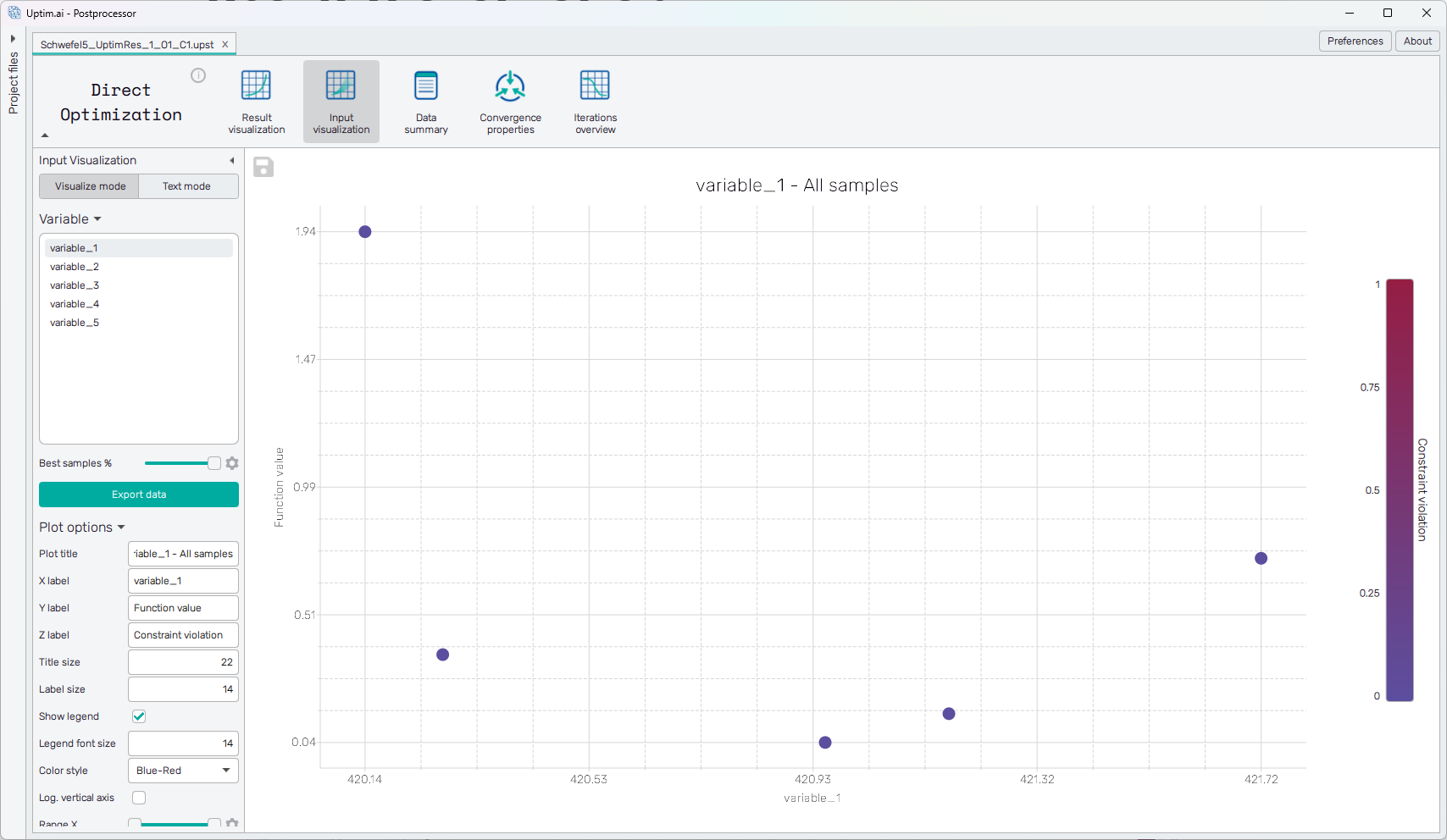
Visualize mode
The samples are presented in the form of a scatter plot (shown in Figure 1). The X-axis represents the value of the selected input variable (from the sidebar). The Y-axis shows the function value. In case all samples have zero constraint violation, this is the same as the actual function value. Finally, the coloring of the markers in the scatter plot represents the constraint violation itself. Ideally, if the optimization process converged properly, at least the best sample should have a zero constraint violation.
The plot has the following configuration options, also found in the sidebar:
-
Plot title : Displayed above the plot.
-
X label : Label of the X axis.
-
Y label : Label of the Y axis.
-
Z label : Label of the Z axis (represented by color, shown on the right side of the plot).
-
Title size : Size of the title font.
-
Label size : Size of the label font.
-
Show legend : Switching on/off the legend of the plot/the colorbar scale.
-
Legend font size : Size of the legend font.
-
Color style : Selection menu setting the colormap.
-
Range X : Double-sided slider allowing to show a slice of the data in detail. Dragging one of the slider's points limits the depicted range of output value, one can move with the section along the X-axis by dragging the green bar of the slider (both edge points are highlighted).
-
Range Y : Double-sided slider allowing to show a slice of the data in detail. Dragging one of the slider's points limits the depicted range of output value, one can move with the section along the Y-axis by dragging the green bar of the slider (both edge points are highlighted).
-
Range Z : Double-sided slider allowing to show a slice of the data in detail. Dragging one of the slider's points limits the depicted range of input variable value, one can move with the section along the range of the input by dragging the green bar of the slider (both edge points are highlighted).
tipAll ranges in the plot can be also set precisely using the ⚙ icon on the right of each slider. This opens a sub-dialogue with entry fields for writing exact values of range limits. These need to be confirmed with the Set button. Setting values outside domain's boundaries will reset range limits to the default state.
-
Adjust axes : Toggle if the axis and/or colorbar limits of the plot should be only the range adjusted with the slider above (on) or the full range of the input distribution (off).